Customize Consent Preferences

We use cookies to help you navigate efficiently and perform certain functions. You will find detailed information about all cookies under each consent category below.

The cookies that are categorized as "Necessary" are stored on your browser as they are essential for enabling the basic functionalities of the site. ... 

Always Active

Necessary cookies are required to enable the basic features of this site, such as providing secure log-in or adjusting your consent preferences. These cookies do not store any personally identifiable data.

No cookies to display.

Functional cookies help perform certain functionalities like sharing the content of the website on social media platforms, collecting feedback, and other third-party features.

No cookies to display.

Analytical cookies are used to understand how visitors interact with the website. These cookies help provide information on metrics such as the number of visitors, bounce rate, traffic source, etc.

No cookies to display.

Performance cookies are used to understand and analyze the key performance indexes of the website which helps in delivering a better user experience for the visitors.

No cookies to display.

Advertisement cookies are used to provide visitors with customized advertisements based on the pages you visited previously and to analyze the effectiveness of the ad campaigns.

No cookies to display.

Published in Web Development for Designers
on March 4, 2025

Collaboration between design and development teams is essential for delivering efficient, high-quality web projects. When designers and developers work seamlessly together, the result is not just faster workflows but also better user experiences. By mastering techniques to collaborate design development, teams can overcome communication gaps, reduce errors, and produce visually cohesive and functional websites.

This guide explores strategies, tools, and best practices for improving collaboration between design and development teams, leading to more productive projects and superior results.

The Importance of Collaboration in Design and Development

Streamlined Workflows

Collaboration ensures that both teams are aligned, reducing misunderstandings and unnecessary revisions. This streamlining accelerates the project timeline.

Enhanced Creativity

Open communication fosters creative problem-solving, allowing designers and developers to contribute unique insights and ideas.

Improved Quality

When teams work together, the end product is more likely to meet both design and technical standards, ensuring user satisfaction.

Reduced Costs

Efficient collaboration minimizes rework, saving time and resources, which is particularly beneficial for tight budgets.

For additional insights, visit Smashing Magazine’s collaboration tips.

Challenges in Design and Development Collaboration

Communication Gaps

Misunderstandings between designers and developers often arise due to differences in language, tools, and priorities.

Lack of Clear Roles

Unclear responsibilities can lead to overlaps or gaps in tasks, causing delays.

Tool Incompatibility

Using incompatible tools or software can hinder seamless collaboration, leading to inefficiencies.

Unrealistic Timelines

Unrealistic deadlines can create pressure, resulting in compromised quality or strained team dynamics.

Strategies to Enhance Collaboration

Establish Clear Goals

Define project objectives, deliverables, and milestones at the start. Ensure that both teams understand the end goals and their roles in achieving them.

Use a Centralized Platform

Leverage project management tools like Asana, Trello, or Jira to track progress, assign tasks, and maintain transparency.

Create a Shared Style Guide

Develop a comprehensive style guide outlining typography, colors, components, and interactions. This ensures consistency and clarity for both teams.

Adopt a Design System

Using design systems like Material Design or Bootstrap streamlines workflows by providing reusable components and guidelines.

Foster Open Communication

Encourage regular check-ins, feedback sessions, and open channels for questions and clarifications. Tools like Slack or Microsoft Teams can facilitate communication.

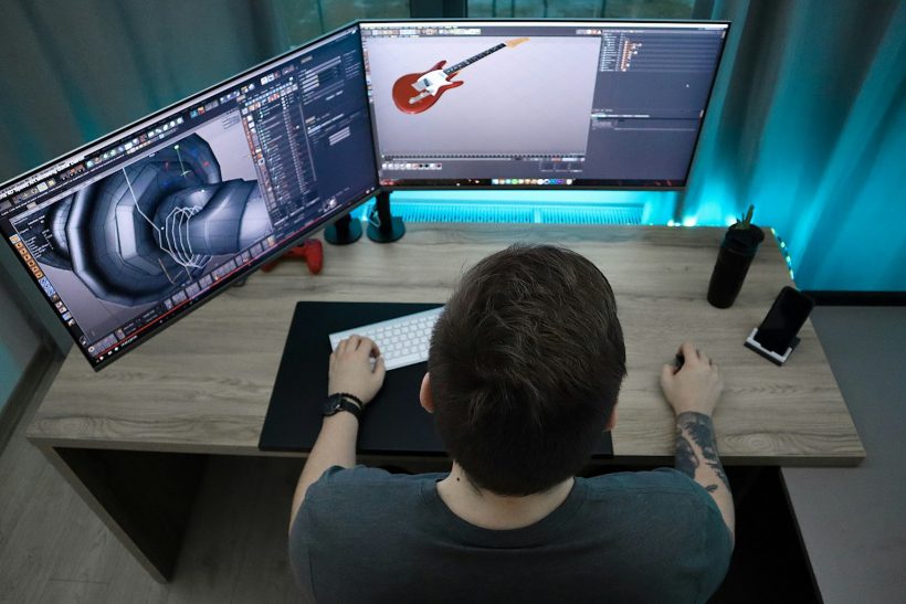
Tools for Collaboration

Figma

Figma allows real-time collaboration between designers and developers. Developers can inspect designs and export assets directly, reducing dependency on designers for updates.

Zeplin

Zeplin bridges the gap between design and development by providing detailed specifications, assets, and style guides.

Adobe XD

Adobe XD offers features like developer handoff, making it easy for developers to extract design elements and code snippets.

GitHub

GitHub supports version control and collaboration, enabling teams to work on the same codebase without conflicts.

Notion

Notion serves as a central hub for documentation, task tracking, and brainstorming, keeping teams aligned.

Bridging the Gap Between Designers and Developers

Align on Terminology

Ensure that both teams understand and agree on terms used in the project, such as components, layouts, and interactions.

Provide Developer-Friendly Designs

Designers should create developer-friendly designs by using grids, clear naming conventions, and consistent spacing.

Share Feedback Effectively

Offer constructive feedback that focuses on improving the design or functionality rather than critiquing the individual.

Test Prototypes Together

Both teams should participate in testing prototypes to identify potential issues early and refine the design accordingly.

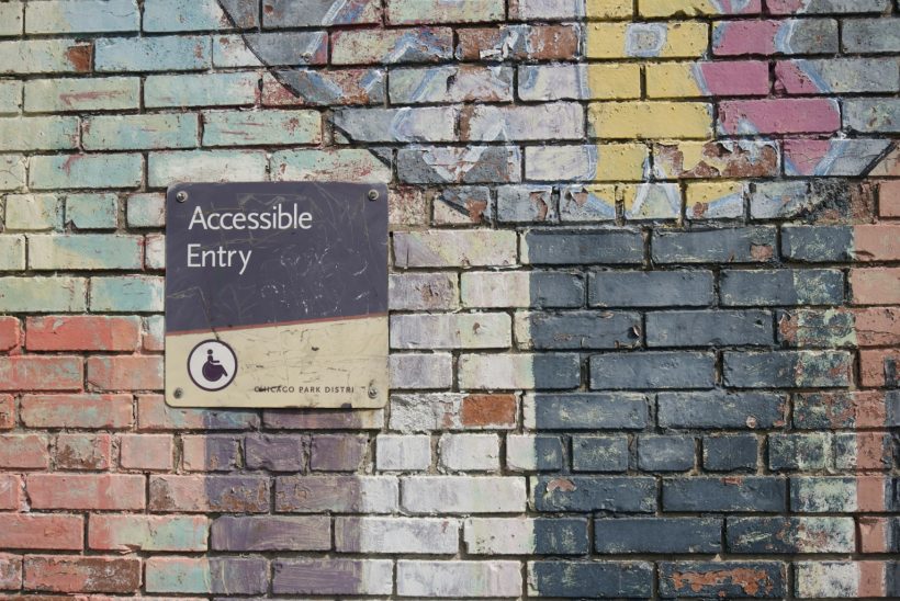
Prioritize Accessibility

Ensure that designs and code adhere to accessibility standards, creating inclusive experiences for all users.

Benefits of Collaboration

Faster Time-to-Market

Effective collaboration reduces delays and ensures timely delivery, giving businesses a competitive edge.

Better Alignment

When both teams understand the project’s goals and requirements, the result is a cohesive product that meets user expectations.

Greater Job Satisfaction

Collaborative environments foster mutual respect and understanding, improving morale and satisfaction for both teams.

Scalable Solutions

Collaboration often leads to the creation of reusable components and processes, enabling scalability for future projects.

Best Practices for Collaboration

Involve Both Teams Early

Include designers and developers in initial discussions to align expectations and avoid surprises later.

Use Prototypes

Interactive prototypes provide a clear visual and functional reference, reducing ambiguity in implementation.

Encourage Continuous Learning

Provide opportunities for designers to learn coding basics and developers to understand design principles, fostering empathy and collaboration.

Regularly Review Progress

Schedule regular reviews to track progress, discuss challenges, and make adjustments as needed.

Celebrate Milestones

Acknowledge and celebrate team achievements to maintain motivation and a positive atmosphere.

Real-Life Applications

E-commerce Platforms

An online retailer streamlined collaboration by using Figma and Zeplin, ensuring accurate product page designs and faster development cycles.

Corporate Websites

A consulting firm adopted a shared design system, enabling designers and developers to reuse components and accelerate project delivery.

SaaS Applications

A SaaS company used GitHub and Jira to align teams on feature development, reducing bugs and improving user satisfaction.

Common Collaboration Mistakes and How to Avoid Them

Ignoring Developer Feedback

Designers should seek input from developers early to ensure designs are technically feasible.

Skipping Documentation

Always document decisions, processes, and guidelines to avoid confusion and miscommunication.

Overloading Tools

Using too many tools can create confusion. Select a few reliable tools that meet the team’s needs.

Neglecting User Needs

Focus on delivering user-centric designs and functionality rather than meeting internal preferences.

Monitoring and Refining Collaboration

Gather Feedback

Regularly collect feedback from team members to identify areas for improvement in collaboration processes.

Analyze Project Metrics

Track project timelines, task completion rates, and revision cycles to evaluate collaboration effectiveness.

Conduct Post-Mortems

After project completion, hold a post-mortem meeting to discuss what worked well and what could be improved.

Conclusion

Collaboration between design and development teams is essential for creating high-quality web projects efficiently. By implementing the strategies and tools outlined in this guide, teams can collaborate design development processes more effectively, achieving faster results and delivering superior user experiences.

For additional resources, explore InVision’s Collaboration Guide. With the right approach, communication, and tools, seamless collaboration can transform your workflows and elevate your projects.

Published in Web Development for Designers
on February 27, 2025

Style guides play a pivotal role in ensuring consistency and efficiency in web development projects. They act as a blueprint, aligning designers, developers, and stakeholders with a unified vision. A well-crafted style guide for web projects defines the rules and standards for visual and functional elements, enabling teams to deliver cohesive and professional websites.

This guide explores the significance of style guides, how to create them, and the best practices for integrating them into your workflow to achieve outstanding results.

What Are Style Guides for Web Projects?

A style guide is a document or resource that outlines the design and coding standards for a web project. It includes rules for typography, colors, spacing, imagery, components, and interactions, ensuring a unified look and feel throughout the website.

Style guides can take various forms, from static documents to dynamic, interactive libraries accessible through tools like Figma, Sketch, or online platforms.

For inspiration, explore examples on Styleguides.io.

Why Style Guides Matter in Web Projects

Consistency Across Designs

Style guides ensure that all pages and components of a website follow the same visual and functional principles, avoiding discrepancies.

Improved Team Collaboration

With a central reference, designers and developers can work in sync, reducing miscommunications and speeding up workflows.

Faster Development

Reusing predefined styles and components reduces the need to start from scratch, accelerating the development process.

Enhanced User Experience

Consistency in design leads to familiarity, making navigation and interaction intuitive for users.

Scalability

A well-maintained style guide allows for seamless updates and expansions, ensuring that new additions align with the original design principles.

Key Components of a Web Style Guide

Typography

Define rules for fonts, sizes, line heights, and weights to ensure text is readable and aesthetically pleasing.

Example:

:root {  
  --font-primary: 'Roboto', sans-serif;  
  --font-size-base: 16px;  
  --line-height-base: 1.5;  
}  

Colors

List the primary, secondary, and neutral colors used in the project, along with their hex or RGB values.

Example:

$primary-color: #3498db;  
$secondary-color: #2ecc71;  
$neutral-color: #f5f5f5;  

Spacing

Specify rules for padding, margins, and grid layouts to maintain uniformity across elements.

Example:

.spacing {  
  margin: 16px;  
  padding: 8px;  
}  

Components

Document reusable components such as buttons, cards, forms, and navigation menus, along with their states (hover, focus, active).

Imagery and Icons

Provide guidelines for image dimensions, formats, and placement, as well as rules for iconography.

Accessibility Standards

Include accessibility principles, such as color contrast ratios, keyboard navigation, and screen reader compatibility, ensuring inclusivity.

Creating a Style Guide for Your Web Project

Audit Existing Assets

Review the current designs and components to identify patterns, inconsistencies, and areas requiring standardization.

Choose a Tool

Decide on a platform to host your style guide. Tools like Figma, Zeroheight, or static documentation sites work well for collaborative projects.

Define Core Elements

Start by documenting typography, colors, and spacing, as these are the foundation of any design system.

Build Component Libraries

Develop a library of reusable components, documenting their structure, usage, and variations.

Incorporate Code Snippets

Provide CSS or JavaScript snippets alongside design guidelines to streamline implementation for developers.

Include Examples

Add real-world examples of how styles and components should be used to clarify their purpose.

Best Practices for Style Guides

Keep It Up to Date

Regularly update your style guide to reflect changes in design trends, branding, or project requirements.

Make It Accessible

Ensure all team members can easily access and contribute to the style guide, promoting collaboration and consistency.

Focus on Reusability

Design components that can be reused across multiple pages and projects, reducing redundancy.

Emphasize Documentation

Provide clear and detailed documentation for each style and component, leaving no room for ambiguity.

Test for Accessibility

Ensure your style guide adheres to accessibility standards, such as WCAG, to create inclusive designs.

Benefits of Using Style Guides

Reduced Errors

Style guides minimize errors by providing a clear reference for design and development decisions.

Better Branding

By standardizing visual elements, style guides reinforce brand identity across all digital platforms.

Faster Onboarding

New team members can quickly understand the project’s design and coding standards, reducing onboarding time.

Cost Efficiency

Reusing components and adhering to standardized practices saves time and resources during development.

Challenges of Implementing Style Guides

Initial Investment

Creating a comprehensive style guide requires time and effort upfront, which may seem daunting for small teams.

Maintaining Consistency

As projects evolve, keeping the style guide updated and ensuring adherence can be challenging.

Balancing Flexibility and Rules

Overly rigid guidelines may stifle creativity, while overly flexible ones can lead to inconsistencies.

Real-Life Applications

E-commerce Websites

A retail website used a style guide to standardize product pages, ensuring consistent typography, colors, and button styles across categories.

Corporate Portals

A consulting firm created a style guide to maintain branding consistency across its website and client-facing materials.

Blogging Platforms

A blog implemented a style guide for reusable components like author profiles, post layouts, and category labels, enhancing scalability.

Tools for Building and Managing Style Guides

Pattern Lab

Pattern Lab helps create dynamic, interactive style guides using atomic design principles.

Storybook

Storybook is a popular tool for documenting UI components in React, Vue, or Angular projects.

Zeroheight

Zeroheight integrates with design tools like Figma to create collaborative style guides.

Frontify

Frontify is a cloud-based platform for managing branding and style guides.

Monitoring and Refining Style Guides

Conduct Regular Audits

Periodically review your style guide to identify outdated components or inconsistencies.

Gather Feedback

Collect input from designers, developers, and stakeholders to improve the guide’s usability and relevance.

Use Analytics

Track how often components or guidelines are used to identify gaps or redundant elements.

Conclusion

Style guides are indispensable for maintaining consistency, efficiency, and collaboration in web projects. By creating and adhering to a style guide for web projects, teams can produce visually cohesive, scalable, and user-friendly websites that align with brand identity and user expectations.

For additional resources, explore Google’s Material Design Guidelines or tools like Pattern Lab. With a well-structured style guide, your web projects will not only meet but exceed design and development goals.

Published in Front-End Development Best Practices
on February 25, 2025

In the world of web development, aligning a finished website to match the original design mockups is a crucial goal. Pixel perfect development ensures that every detail, from spacing to typography, matches the designer’s vision with precision. This practice not only enhances the aesthetics of a website but also builds trust between designers and developers, resulting in a seamless user experience.

This guide explores what pixel perfect development is, its importance, tools and techniques to achieve it, and best practices to bridge the gap between design and implementation.

What Is Pixel Perfect Development?

Pixel perfect development is the practice of implementing a design exactly as it appears in the mockups, ensuring every visual detail is accounted for. This means that layouts, font sizes, colors, and spacing align perfectly with the original design files, whether they were created in tools like Photoshop, Figma, or Sketch.

The goal is to translate the visual fidelity of the design into code without any deviation, ensuring a cohesive and professional appearance across all devices.

For an introduction to pixel perfect principles, visit Smashing Magazine’s Guide.

Why Pixel Perfect Development Matters

Enhances Visual Consistency

Pixel perfect development ensures that a website’s layout and design remain consistent across different devices and browsers, providing a unified user experience.

Builds Trust

Delivering a design exactly as envisioned reinforces trust between developers and designers, fostering better collaboration.

Boosts Brand Identity

Accurate implementation preserves branding elements, such as logo placement, colors, and typography, ensuring the brand’s visual identity is represented effectively.

Increases User Engagement

Users are more likely to engage with a visually appealing and professionally designed website, making pixel perfect development essential for conversion-focused projects.

Key Elements of Pixel Perfect Development

Precision in Layouts

Accurate placement of elements, such as images, text, and buttons, ensures the design flows harmoniously.

Consistency in Typography

Matching font sizes, weights, and spacing to the design improves readability and aesthetic appeal.

Correct Colors

Using the exact color values from the design maintains the intended visual impact and brand alignment.

Attention to Detail

Details like shadows, borders, and hover effects must be carefully implemented to align with the design specifications.

Tools for Pixel Perfect Development

Design Software

Tools like Figma, Sketch, and Adobe XD provide features for exporting assets and measurements, making it easier to translate designs into code.

Browser Developer Tools

Inspect elements and adjust styles directly in the browser to fine-tune your implementation. Chrome DevTools and Firefox Developer Tools are popular options.

Pixel Perfect Tools

Plugins like PixelSnap and browser extensions like PerfectPixel overlay the design on the live site, enabling developers to compare and align elements accurately.

Code Editors

Editors like Visual Studio Code offer extensions and features that aid in maintaining clean, precise code.

How to Achieve Pixel Perfect Development

Analyze the Design

Start by thoroughly understanding the design file. Identify key components, reusable elements, and complex sections. Use tools like Figma’s inspect mode to gather measurements, colors, and font details.

Use CSS Grid and Flexbox

CSS Grid and Flexbox are powerful layout tools that allow for precise alignment and spacing, making it easier to replicate designs accurately.

Example using CSS Grid:

.container {  
  display: grid;  
  grid-template-columns: repeat(3, 1fr);  
  gap: 20px;  
}  

Leverage Design Tokens

Design tokens store reusable values like colors, fonts, and spacing, ensuring consistency across the project.

Example:

:root {  
  --primary-color: #3498db;  
  --font-size-base: 16px;  
}  

Ensure Responsive Design

Achieving pixel perfect development also involves adapting the design for various screen sizes. Use media queries to fine-tune layouts for different devices.

Example:

@media (max-width: 768px) {  
  .container {  
    flex-direction: column;  
  }  
}  

Use Accurate Measurements

Align margins, padding, and spacing according to the design specifications. Avoid using approximations that deviate from the design file.

Best Practices for Pixel Perfect Development

Communicate with Designers

Maintain open communication with designers to clarify design intentions and resolve ambiguities. Regular feedback loops ensure alignment.

Work in Iterations

Break the design into manageable sections and work iteratively, focusing on achieving perfection in each part before moving to the next.

Test on Multiple Devices

Use tools like BrowserStack to test your implementation across devices and browsers to ensure visual consistency.

Optimize for Performance

While achieving pixel perfection, ensure your code is optimized for speed and scalability, avoiding overly complex solutions.

Document Your Process

Document your styling choices, reusable components, and design tokens to maintain consistency across teams.

Challenges of Pixel Perfect Development

Differences in Rendering

Browsers may render styles slightly differently, requiring adjustments to maintain visual consistency.

Time-Intensive

Achieving pixel perfection can be time-consuming, especially for intricate designs. Prioritize key elements and allocate time efficiently.

Dynamic Content

Implementing pixel perfect designs with dynamic content, such as user-generated posts or product listings, requires flexible solutions.

Scalability

Ensuring that a pixel perfect design remains scalable and adaptable for future changes is a complex yet essential task.

Real-Life Applications

E-commerce Websites

Pixel perfect development ensures product pages align with brand identity and provide an intuitive user experience, increasing conversions.

Portfolio Websites

Designers and agencies rely on pixel perfect implementation to showcase their work with precision and professionalism.

Corporate Websites

Maintaining consistent typography, layouts, and branding across all pages strengthens a company’s credibility and visual appeal.

Monitoring and Refining Pixel Perfect Designs

Perform Regular Reviews

Overlay designs on live sites using tools like PerfectPixel to identify discrepancies and make necessary adjustments.

Use Analytics

Track user behavior to identify areas where design perfection enhances engagement or usability.

Gather Feedback

Incorporate feedback from designers, clients, and users to refine your implementation and resolve inconsistencies.

Conclusion

Pixel perfect development is a collaborative effort that bridges the gap between design and code, delivering websites that are visually precise and functionally robust. By mastering the techniques and tools of pixel perfect development, developers can meet designer expectations, build trust, and create engaging user experiences.

For additional resources, explore Awwwards’ Design Principles or start using tools like PerfectPixel. With the right approach and dedication to detail, you can transform static designs into flawless, responsive websites that captivate users and elevate brand identity.

Published in Front-End Development Best Practices
on February 20, 2025

Creating accessible front-end designs ensures that your website can be used by everyone, including individuals with disabilities. Accessibility is not just about meeting compliance standards; it’s about delivering a user-friendly experience for all audiences. By prioritizing accessibility front-end designs, developers can build inclusive websites that enhance usability, improve SEO, and reach a broader audience.

This guide explores essential practices for designing accessible front-end interfaces, tools to streamline the process, and how accessibility benefits your website’s performance and audience engagement.

What Is Accessibility in Front-End Design?

Accessibility in front-end design refers to designing and coding websites so that they can be used by individuals with diverse abilities, including those with visual, auditory, motor, or cognitive impairments. It involves ensuring compatibility with assistive technologies such as screen readers and making interfaces intuitive for all users.

Accessibility guidelines are outlined in the Web Content Accessibility Guidelines (WCAG), which provide a comprehensive framework for creating accessible web content.

Why Accessibility Matters

Inclusive User Experience

Accessibility allows all users to interact with your website seamlessly, regardless of their physical or cognitive abilities.

Legal Compliance

Many countries enforce accessibility standards, such as the Americans with Disabilities Act (ADA) in the U.S. and the European Accessibility Act. Non-compliance can result in legal repercussions.

Improved SEO

Search engines favor accessible websites, as features like semantic HTML and alt text also enhance search engine visibility.

Expanded Audience

Making your website accessible opens it up to millions of users who rely on assistive technologies, expanding your potential audience.

For an in-depth understanding of the benefits, explore W3C’s Accessibility Introduction.

Key Principles of Accessible Front-End Design

Perceivable

Content must be presented in ways that users can perceive, including providing text alternatives for non-text content and captions for multimedia.

Operable

Users must be able to interact with the interface, including using keyboard navigation and accessible forms.

Understandable

The website should have a clear and predictable layout, avoiding complex navigation structures.

Robust

The website should function across a variety of devices, browsers, and assistive technologies.

Best Practices for Accessibility in Front-End Designs

Use Semantic HTML

Semantic HTML provides meaning to content, making it easier for assistive technologies to interpret.

Example:

<header>  
  <h1>Website Title</h1>  
  <nav>  
    <ul>  
      <li><a href="#home">Home</a></li>  
      <li><a href="#about">About</a></li>  
    </ul>  
  </nav>  
</header>  

Include Alt Text for Images

Provide descriptive alt text for all images to convey their meaning to screen readers.

Example:

<img src="example.jpg" alt="A scenic mountain view during sunrise">  

Design for Keyboard Navigation

Ensure that all interactive elements, such as buttons and forms, are operable via keyboard. Use the tabindex attribute to define navigation order.

Example:

<button tabindex="0">Click Me</button>  

Provide Sufficient Color Contrast

Ensure text is readable against its background by maintaining a high contrast ratio. Use tools like Contrast Checker to test your color schemes.

Implement ARIA Roles

Accessible Rich Internet Applications (ARIA) roles add extra information for assistive technologies.

Example:

<div role="alert">Form submission successful!</div>  

Use Responsive Design

Responsive layouts ensure accessibility across various devices, from desktops to smartphones. Leverage media queries for optimized designs:

@media (max-width: 768px) {  
  body {  
    font-size: 16px;  
  }  
}  

Add Captions to Multimedia

Include captions or transcripts for video and audio content to assist users with hearing impairments.

Test with Assistive Technologies

Use screen readers like NVDA or JAWS to test your design and ensure it’s compatible with assistive tools.

Tools for Creating Accessible Designs

WAVE Accessibility Tool

The WAVE tool evaluates your website for accessibility issues and suggests improvements.

axe Accessibility Checker

The axe browser extension identifies and highlights accessibility violations in your code.

Lighthouse

Google’s Lighthouse provides accessibility audits as part of its overall performance analysis.

Color Contrast Analyzer

This tool helps you check if your color combinations meet WCAG standards.

HeadingsMap

HeadingsMap is a browser extension that visualizes your page’s heading structure to ensure it’s logical and accessible.

Benefits of Accessible Front-End Designs

Improved User Retention

Accessible designs reduce frustration for users, leading to higher engagement and lower bounce rates.

Better Performance Metrics

Optimized code for accessibility often results in faster loading times and smoother navigation.

Enhanced Reputation

Demonstrating a commitment to inclusivity builds trust and enhances your brand’s reputation.

Avoiding Common Accessibility Mistakes

Missing Alt Text

Always provide alt text for images. Empty alt attributes should only be used for decorative images.

Using Non-Descriptive Links

Avoid vague phrases like “click here.” Instead, use descriptive text such as “Read our accessibility guide.”

Overlooking Focus States

Ensure that focus states are visible for keyboard navigation, especially for links and buttons.

Example:

button:focus {  
  outline: 2px solid #3498db;  
}  

Ignoring Mobile Accessibility

Test your website’s accessibility on mobile devices to ensure compatibility with touch-based interactions.

Real-Life Applications of Accessible Design

E-commerce Platforms

An online retailer added ARIA roles and improved keyboard navigation, increasing sales from users relying on assistive technologies.

Educational Websites

An educational portal implemented captions for video lectures, boosting accessibility for students with hearing impairments.

Corporate Websites

A consulting firm optimized its website for screen readers, improving usability for visually impaired clients and partners.

Monitoring Accessibility Compliance

Run Regular Audits

Use tools like Lighthouse and WAVE to perform regular accessibility audits.

Analyze User Behavior

Track user engagement with analytics tools to identify areas for improvement.

Gather Feedback

Solicit feedback from users with disabilities to understand their experience and refine your design.

Conclusion

Building accessible front-end designs is not just a legal obligation but a moral responsibility to ensure inclusivity. By adopting best practices for accessibility front-end designs, developers can create websites that are usable by everyone, regardless of their abilities.

For more resources, explore the Web Accessibility Initiative (WAI) or tools like axe. With the right approach and tools, accessibility can become an integral part of your front-end workflow, benefiting both users and your website’s overall performance.

Published in Front-End Development Best Practices
on February 18, 2025

Front-end development often involves repetitive tasks, complex styling requirements, and the need to maintain consistent code across projects. CSS preprocessors like Sass and LESS address these challenges by introducing powerful features that enhance the efficiency of preprocessors front-end workflow. They simplify code management, promote reusability, and streamline workflows, allowing developers to focus on creating exceptional user experiences.

This guide explores how preprocessors transform front-end workflows, their key features, and best practices to implement them effectively.

What Are CSS Preprocessors?

CSS preprocessors are scripting languages that extend the capabilities of standard CSS by introducing advanced features such as variables, nesting, mixins, and functions. These tools compile their custom syntax into regular CSS that browsers can interpret.

Popular preprocessors include:

  • Sass: Known for its flexibility and robust features.
  • LESS: A user-friendly preprocessor with a syntax similar to CSS.
  • Stylus: Offers concise syntax and extensive customization options.

For an introduction to preprocessors, visit MDN Web Docs on Sass.

Why Use Preprocessors in Front-End Development?

Simplify Code Management

Preprocessors allow developers to write cleaner and more modular code, making it easier to maintain and update styles.

Reuse Code Across Projects

Features like variables and mixins promote reusability, reducing redundancy and ensuring consistency across multiple projects.

Enhance Productivity

By automating repetitive tasks, preprocessors save time and improve productivity, especially for large-scale projects.

Improve Collaboration

Preprocessors make code more readable and structured, simplifying collaboration among team members.

Key Features of CSS Preprocessors

Variables

Variables store reusable values like colors, fonts, or dimensions, making it easy to update these values globally.

Example in Sass:

$primary-color: #3498db;  
body {  
  background-color: $primary-color;  
}  

Nesting

Preprocessors allow developers to nest styles within their parent selectors, mirroring the structure of HTML.

Example in LESS:

nav {  
  ul {  
    li {  
      a {  
        color: #fff;  
      }  
    }  
  }  
}  

Mixins

Mixins are reusable blocks of code that can be included wherever needed, reducing duplication.

Example in Sass:

@mixin border-radius($radius) {  
  -webkit-border-radius: $radius;  
  -moz-border-radius: $radius;  
  border-radius: $radius;  
}  
button {  
  @include border-radius(10px);  
}  

Functions

Preprocessors provide functions for performing calculations or manipulating values, adding dynamic capabilities to CSS.

Example in Sass:

$base-font-size: 16px;  
p {  
  font-size: lighten($base-font-size, 10%);  
}  

Partials and Importing

Break styles into smaller, manageable files using partials, then combine them with @import.

Example:

// _variables.scss  
$font-stack: Helvetica, sans-serif;  
$text-color: #333;  

// styles.scss  
@import 'variables';  
body {  
  font-family: $font-stack;  
  color: $text-color;  
}  

Setting Up a Preprocessor Workflow

Install a Preprocessor

  1. Install Node.js and a package manager like npm.
  2. Install the desired preprocessor using npm. For Sass: npm install -g sass

Set Up Your Project

Organize your project structure with folders for:

  • SCSS or LESS files: For writing preprocessed styles.
  • CSS files: For compiled styles.

Compile the Code

Use command-line tools or task runners like Gulp to compile your preprocessor code into CSS.

Example of Sass compilation:

sass input.scss output.css  

Integrating Preprocessors with Tools

Gulp

Gulp automates tasks like compiling, minifying, and autoprefixing.

Example:

const gulp = require('gulp');  
const sass = require('gulp-sass')(require('sass'));  
gulp.task('sass', function () {  
  return gulp.src('scss/*.scss')  
    .pipe(sass().on('error', sass.logError))  
    .pipe(gulp.dest('css'));  
});  

Webpack

Webpack bundles assets, including styles written in preprocessors.

For Sass integration, add the following configuration:

module.exports = {  
  module: {  
    rules: [  
      {  
        test: /\.scss$/,  
        use: ['style-loader', 'css-loader', 'sass-loader'],  
      },  
    ],  
  },  
};  

Best Practices for Using Preprocessors

Keep Code Modular

Organize styles into partials for easier maintenance. For example, separate styles for typography, layout, and components.

Use Meaningful Variable Names

Choose descriptive variable names to make your code more readable. Example: $brand-primary instead of $color1.

Leverage Functions and Mixins

Use functions and mixins to reduce redundancy and ensure consistency across styles.

Optimize Performance

Minimize the output by using compressed styles during production. Example in Sass:

sass input.scss output.css --style compressed  

Regularly Update Dependencies

Keep your preprocessor and related tools updated to access the latest features and security fixes.

Advantages of Preprocessors in Front-End Workflows

Improved Maintainability

By structuring code with variables, nesting, and partials, preprocessors simplify updates and bug fixes.

Enhanced Consistency

Variables and mixins ensure uniform styles across a project, reducing inconsistencies.

Faster Prototyping

Preprocessors speed up the creation of prototypes by automating repetitive tasks.

Cross-Browser Compatibility

Preprocessors support autoprefixing, ensuring compatibility with older browsers.

Tools to Enhance Preprocessor Workflows

Code Editors

Use editors like Visual Studio Code with extensions for preprocessors.

Online Compilers

Platforms like SassMeister allow you to write and test preprocessor code online.

Browser Developer Tools

Inspect and debug preprocessed styles using browser developer tools.

Challenges and How to Overcome Them

Learning Curve

Preprocessors require time to master, but tutorials and resources like CSS-Tricks can help.

Compilation Overhead

Use automation tools like Gulp or Webpack to streamline the compilation process.

Debugging Issues

Enable source maps for better debugging in browser developer tools.

Example in Sass:

sass input.scss output.css --sourcemap  

Real-Life Applications of Preprocessors

E-commerce Websites

An online retailer used Sass to standardize styles across product pages, improving consistency and reducing code duplication.

Blogging Platforms

A blogging site leveraged preprocessors to implement a modular design system, enhancing scalability.

Corporate Websites

A consulting firm utilized LESS to maintain brand colors and typography across a multi-page site efficiently.

Monitoring Performance

Analyze Styles

Use tools like PurifyCSS to remove unused styles and optimize performance.

Test Responsiveness

Ensure preprocessed styles adapt seamlessly across devices using BrowserStack.

Evaluate Load Times

Measure style impact on page speed with Google PageSpeed Insights.

Conclusion

CSS preprocessors are transformative tools that elevate front-end workflows, offering efficiency, consistency, and flexibility. By integrating preprocessors front-end workflow into your projects, you can simplify tasks, reduce redundancy, and deliver high-quality designs faster.

For additional resources, explore Sass Documentation or LESS Documentation. With the right approach and tools, preprocessors can streamline your development process, enabling you to focus on creating exceptional user experiences.

Published in Responsive Web Design
on February 13, 2025

Flexbox, short for the Flexible Box Layout Module, has revolutionized how web developers create responsive designs. By offering an intuitive way to manage layouts, align elements, and distribute space within containers, Flexbox responsive web design simplifies workflows and enhances the user experience across devices.

This guide explores the fundamentals of Flexbox, its application in responsive design, and best practices to help you create adaptable, efficient layouts.

What Is Flexbox in Web Design?

Flexbox is a CSS layout model designed to provide flexibility and control over the alignment, distribution, and sizing of items within a container. Unlike traditional layouts relying heavily on floats or positioning, Flexbox makes it easier to create responsive, dynamic designs.

For example, a Flexbox container automatically adjusts its child elements based on the available space, ensuring a clean and organized layout on different screen sizes.

CSS declaration for a Flexbox container:

.container {  
  display: flex;  
}  

For a detailed introduction, visit MDN Web Docs on Flexbox.

Why Use Flexbox for Responsive Web Design?

Simplified Alignment

Flexbox eliminates the need for complex CSS hacks to align elements. With properties like justify-content and align-items, centering or aligning elements is straightforward.

Dynamic Layouts

Flexbox adapts to varying screen sizes, making it ideal for creating mobile-first designs.

Space Distribution

It allows developers to evenly distribute space between elements or adjust spacing dynamically based on the content.

Cross-Browser Compatibility

Flexbox works seamlessly across modern browsers, ensuring consistent performance.

For compatibility details, check Can I Use Flexbox.

Key Concepts of Flexbox

Flex Container

The parent element that holds the child elements. Setting display: flex; on a container enables Flexbox.

Flex Items

The child elements within the container that align and adjust based on the Flexbox properties.

Main Axis and Cross Axis

Flexbox operates along two axes:

  • Main Axis: The primary direction of alignment (horizontal by default).
  • Cross Axis: The perpendicular direction (vertical by default).

Flex Properties

Key properties of Flexbox include:

  • flex-direction: Defines the main axis direction (row, row-reverse, column, column-reverse).
  • justify-content: Aligns items along the main axis (flex-start, flex-end, center, space-between, space-around).
  • align-items: Aligns items along the cross axis (stretch, flex-start, flex-end, center).
  • flex-wrap: Specifies whether items should wrap onto the next line.

Building Responsive Web Designs with Flexbox

Creating a Flexible Layout

Start with a basic layout using Flexbox for the container:

.container {  
  display: flex;  
  flex-direction: row;  
  justify-content: space-between;  
  align-items: center;  
}  

Implementing a Mobile-First Approach

Design for smaller screens first, then add media queries for larger devices.

Example:

.container {  
  display: flex;  
  flex-direction: column;  
}  
@media (min-width: 768px) {  
  .container {  
    flex-direction: row;  
  }  
}  

Adjusting Element Sizes

Use the flex shorthand property to control the size of child elements:

.item {  
  flex: 1 1 auto;  
}  

Wrapping Flex Items

Enable wrapping to prevent items from shrinking too small on narrow screens:

.container {  
  flex-wrap: wrap;  
}  

Real-World Applications of Flexbox

Navigation Bars

Flexbox makes it easy to create responsive navigation bars that collapse into hamburger menus on smaller screens.

Example:

.nav {  
  display: flex;  
  justify-content: space-between;  
  align-items: center;  
}  

Image Galleries

Flexbox simplifies the creation of dynamic image grids that adjust spacing and alignment based on the screen size.

Example:

.gallery {  
  display: flex;  
  flex-wrap: wrap;  
  gap: 10px;  
}  

Forms

Aligning form fields and buttons is more efficient with Flexbox:

.form {  
  display: flex;  
  flex-direction: column;  
  gap: 15px;  
}  

Best Practices for Flexbox Responsive Web Design

Combine with Media Queries

Enhance responsiveness by pairing Flexbox with CSS media queries to adjust layouts at different breakpoints.

Use Flexbox for Layout Specifics

Flexbox excels at managing one-dimensional layouts. For more complex grids, consider using CSS Grid alongside Flexbox.

Optimize for Performance

Minimize unnecessary properties and test your Flexbox implementation to ensure optimal performance on all devices.

Test Across Browsers

Verify that your Flexbox layouts work seamlessly on all major browsers and devices using tools like BrowserStack.

Tools to Simplify Flexbox

Flexbox Froggy

An interactive game that teaches the fundamentals of Flexbox in an engaging way. Visit Flexbox Froggy.

CSS Frameworks

Frameworks like Bootstrap and Foundation include pre-built Flexbox utilities.

Online Generators

Tools like CSS Tricks Flexbox Guide provide practical examples and quick reference materials.

Avoiding Common Flexbox Mistakes

Overusing Flexbox

While Flexbox is powerful, it’s not always the best choice for complex, two-dimensional layouts. Use CSS Grid for grids and tables.

Ignoring Accessibility

Ensure that your Flexbox layouts accommodate screen readers and keyboard navigation.

Misusing Flex Properties

Applying unnecessary properties can lead to unintended layout issues. Always test thoroughly.

Monitoring Performance of Flexbox Designs

Use Developer Tools

Inspect your Flexbox implementation with browser developer tools to identify issues or optimize styles.

Evaluate Load Times

Measure the impact of responsive designs on load times using GTmetrix or Google PageSpeed Insights.

Gather User Feedback

Collect feedback to identify usability improvements or fix design inconsistencies.

Conclusion

Flexbox is a game-changer for responsive web design, offering a simplified approach to creating dynamic, adaptable layouts. By mastering Flexbox responsive web design, developers can enhance user experience, optimize workflows, and ensure consistency across devices.

For additional resources, explore the MDN Flexbox Guide or use frameworks like Bootstrap to get started. With the right strategies and tools, Flexbox can transform your approach to responsive web design, making it more efficient and effective.

Published in Responsive Web Design
on February 11, 2025

Responsive design has revolutionized how websites function across various devices, ensuring that content, including images, adapts seamlessly to different screen sizes. Properly scaling images responsive design is a critical part of creating user-friendly, visually appealing websites. By scaling images effectively, developers can improve website performance, enhance user experience, and maintain visual integrity.

This guide explores best practices for scaling images in responsive design, tools to simplify the process, and how to optimize images for performance and accessibility.

Why Scaling Images Matters in Responsive Design

Improved User Experience

Scaled images ensure that visuals fit the device screen perfectly, enhancing the browsing experience for users.

Faster Load Times

Optimized images reduce loading times, particularly on mobile devices with limited bandwidth.

Better SEO Performance

Search engines prioritize fast-loading, mobile-friendly websites, making scaled images an essential part of SEO strategies.

Professional Appearance

Properly scaled images maintain their resolution and proportions, presenting a polished, professional look on any device.

For additional insights on responsive design, visit Google’s Mobile-Friendly Guide.

Principles of Scaling Images

Use Relative Dimensions

Avoid fixed pixel dimensions. Instead, use relative dimensions like percentages to ensure images adapt to their container’s size.

Example:

img {  
  max-width: 100%;  
  height: auto;  
}  

Maintain Aspect Ratio

Maintaining the aspect ratio prevents images from becoming distorted when resized. Tools like CSS aspect-ratio property or padding-top hacks can help.

Example using CSS aspect-ratio:

img {  
  aspect-ratio: 16 / 9;  
  width: 100%;  
  height: auto;  
}  

Use Responsive Image Techniques

Modern HTML5 features like the picture element and srcset attribute provide device-specific image scaling options.

Example of the picture element:

<picture>  
  <source srcset="image-small.jpg" media="(max-width: 600px)">  
  <source srcset="image-medium.jpg" media="(max-width: 1200px)">  
  <img src="image-large.jpg" alt="Responsive image example">  
</picture>  

Best Practices for Scaling Images

Optimize Image Formats

Select appropriate image formats based on content and quality:

  • JPEG: Ideal for photographs.
  • PNG: Best for transparent backgrounds or detailed graphics.
  • SVG: Perfect for icons and scalable vector graphics.
  • WebP: Offers high-quality visuals with smaller file sizes.

Compress Images

Compress images to reduce file size without compromising quality. Tools like TinyPNG or ImageOptim are effective.

Implement Lazy Loading

Lazy loading delays image loading until the user scrolls to the image’s location, improving initial load times.

Example:

<img src="image.jpg" loading="lazy" alt="Lazy loading example">  

Use Content Delivery Networks (CDNs)

CDNs like Cloudflare or ImageKit deliver optimized images from servers closest to the user, speeding up loading times.

Tools for Scaling Images

Responsive Design Frameworks

Frameworks like Bootstrap include utilities for responsive images, reducing manual effort.

Example using Bootstrap:

<img src="image.jpg" class="img-fluid" alt="Responsive image">  

Online Image Editors

Platforms like Canva or Figma allow you to resize and export images for different screen sizes.

Browser Developer Tools

Inspect image behavior on various devices using Chrome DevTools or Firefox Developer Tools.

WordPress Plugins

For WordPress users, plugins like Smush or EWWW Image Optimizer automate image compression and resizing.

Avoiding Common Mistakes

Ignoring Retina Displays

Use high-resolution images for devices with Retina displays, doubling the pixel density of standard images.

Example:

<img src="image-2x.jpg" alt="Retina image" width="300" height="200">  

Overloading with Large Images

Avoid uploading overly large images. Resize them to the maximum required dimensions for your design.

Skipping Mobile Optimization

Ensure images are optimized for small screens by testing with various mobile devices.

Failing to Test Across Browsers

Different browsers may render images differently. Test your scaling techniques on major browsers like Chrome, Safari, and Firefox.

Real-Life Applications of Scaling Images

E-commerce Websites

An online retailer used responsive image techniques to display high-resolution product images on desktops while loading smaller, faster images on mobile devices, improving sales.

Blogging Platforms

A travel blog optimized its images for mobile screens, reducing load times and increasing user engagement by 25%.

Corporate Sites

A consulting firm implemented lazy loading and CDN-delivered images, enhancing site speed and professional appeal.

Accessibility Considerations

Add Alt Text

Include descriptive alt text for all images to improve accessibility and assistive technology compatibility.

Provide Captions

Use captions to describe image context, particularly for content-heavy pages.

Ensure Tap Target Size

Make images and interactive elements large enough for users to tap comfortably on touchscreens.

Test with Accessibility Tools

Use tools like WAVE or axe to verify accessibility compliance.

Monitoring the Performance of Scaled Images

Analyze Load Times

Use tools like GTmetrix or Google PageSpeed Insights to measure the impact of image scaling on site performance.

Monitor Bandwidth Usage

Track bandwidth savings from optimized images using analytics tools provided by your CDN or hosting provider.

Gather User Feedback

Collect feedback on visual quality and performance to refine your image scaling strategy further.

Conclusion

Scaling images in responsive design is not just about aesthetics—it’s about optimizing performance, improving accessibility, and delivering a seamless user experience. By mastering scaling images responsive design, developers can create websites that are visually stunning, fast-loading, and adaptable to any device.

For additional resources, visit Google’s Image Optimization Guide or explore frameworks like Foundation. With the right tools and techniques, you can ensure your website’s images enhance its performance and impact.

Published in Responsive Web Design
on February 6, 2025

Responsive design has become a cornerstone of modern web development, ensuring that websites look and function seamlessly across all devices. Media queries are a vital tool for implementing media queries mobile styling, allowing developers to adapt layouts, styles, and functionality to different screen sizes.

This guide dives into how media queries enhance mobile styling, the best practices for implementation, and tools to streamline the process, helping you achieve precise and efficient results.

Understanding Media Queries

Media queries are CSS rules that apply styles based on specific conditions, such as screen size, resolution, or orientation. By using media queries, developers can create responsive designs that adjust to the unique needs of each device.

For instance, a media query can ensure a navigation menu designed for desktops transforms into a compact dropdown for mobile devices.

Example of a simple media query:

@media (max-width: 768px) {  
  .container {  
    flex-direction: column;  
  }  
}  

For more details, refer to the MDN Web Docs on Media Queries.

Why Media Queries Matter for Mobile Styling

Enhanced User Experience

Responsive designs powered by media queries ensure users can navigate and interact with your website effortlessly, regardless of their device.

SEO Benefits

Search engines like Google prioritize mobile-friendly websites, making responsive design critical for improving rankings and visibility.

Device Adaptability

With countless devices on the market, media queries allow developers to cater to varying screen sizes, from smartphones to tablets.

Brand Consistency

Media queries ensure design elements, such as typography and imagery, remain consistent across devices, reinforcing brand identity.

Key Components of Media Queries

Breakpoints

Breakpoints define the conditions under which specific styles apply. Common breakpoints include:

  • 320px: Small smartphones.
  • 768px: Tablets.
  • 1024px: Small desktops.

Logical Operators

Logical operators like and, not, and only refine media query conditions. Example:

@media only screen and (max-width: 768px) {  
  .header {  
    display: none;  
  }  
}  

Media Features

Media features, such as width, orientation, and resolution, specify the properties to test.

How to Use Media Queries for Mobile Styling

Plan Your Layout

Before writing media queries, define your design for mobile, tablet, and desktop views. Use tools like Figma to create responsive mockups.

Start with Mobile-First Design

Develop styles for smaller screens first, then add styles for larger devices. This approach minimizes redundant code and improves performance.

Example:

.container {  
  display: flex;  
  flex-direction: column;  
}  
@media (min-width: 768px) {  
  .container {  
    flex-direction: row;  
  }  
}  

Use Percentage-Based Widths

Replace fixed widths with percentage-based values to ensure fluid layouts:

.container {  
  width: 100%;  
}  

Adjust Typography

Use relative units like em or rem for font sizes to ensure scalability across devices.

Example:

@media (max-width: 480px) {  
  h1 {  
    font-size: 1.5rem;  
  }  
}  

Optimize Images

Use responsive image techniques, such as the picture element or CSS rules, to deliver appropriately sized images for each device.

Example:

img {  
  max-width: 100%;  
  height: auto;  
}  

Best Practices for Media Queries Mobile Styling

Test on Multiple Devices

Ensure your styles work seamlessly on various devices and browsers using tools like BrowserStack.

Limit the Number of Breakpoints

Use only essential breakpoints to avoid overly complex stylesheets.

Avoid Overwriting

Write media queries logically to prevent unintentional overwriting of styles.

Focus on Performance

Minimize large background images and unnecessary animations to improve loading speeds for mobile users.

Use Frameworks

Frameworks like Bootstrap and Foundation include predefined media queries to simplify responsive design.

Tools to Simplify Media Queries

CSS Preprocessors

Tools like Sass and LESS allow developers to organize and manage media queries efficiently with nested styles.

Example using Sass:

.container {  
  width: 100%;  
  @media (min-width: 768px) {  
    width: 50%;  
  }  
}  

Responsive Design Tools

Platforms like Adobe XD and Sketch provide responsive design features for mockups and prototypes.

Online Testing Platforms

Use testing tools like Responsinator or Screenfly to preview your site on different devices.

Common Mistakes in Mobile Styling

Overloading with Breakpoints

Too many breakpoints can complicate your stylesheets. Focus on key breakpoints for clarity and efficiency.

Ignoring Accessibility

Ensure your mobile styles prioritize accessibility, such as touch-friendly buttons and readable fonts.

Fixed Layouts

Avoid using fixed dimensions for containers or images. Opt for flexible layouts to accommodate different screen sizes.

Neglecting Landscape Orientation

Consider both portrait and landscape orientations in your styling to ensure a complete mobile experience.

Real-Life Applications of Media Queries

E-commerce Stores

An online retailer used media queries to create a collapsible navigation menu for mobile users, improving usability and increasing mobile conversions.

Blogging Sites

A blog implemented media queries to adjust font sizes and line spacing for better readability on smartphones.

Corporate Websites

A consulting firm optimized its service pages with media queries, ensuring the content was legible and professional on all devices.

Monitoring the Performance of Responsive Designs

Analyze Traffic

Use Google Analytics to track mobile traffic and identify areas for improvement.

Measure Load Times

Test loading speeds with GTmetrix or Google PageSpeed Insights.

Collect User Feedback

Gather feedback from users to refine your mobile designs further.

Conclusion

Media queries are indispensable for creating responsive designs that adapt seamlessly to various devices. By mastering media queries mobile styling, developers can enhance user experience, improve SEO, and ensure brand consistency across screens.

For additional resources, visit MDN Web Docs or explore frameworks like Bootstrap. With the right approach and tools, you can achieve precise and efficient mobile styling that sets your website apart.

Published in PSD-to-WordPress Conversion
on February 4, 2025

When converting a Photoshop Document (PSD) design into a WordPress theme, understanding WordPress theme hierarchy is essential. This structured system defines how WordPress organizes and loads template files, allowing developers to create flexible and functional themes. By mastering PSD to WordPress hierarchy, you can streamline development and ensure your theme adheres to WordPress standards.

This guide delves into WordPress theme hierarchy basics, its relevance in PSD conversion, and best practices for creating efficient and adaptable themes.

What Is WordPress Theme Hierarchy?

WordPress theme hierarchy is the logical structure WordPress follows to determine which template file to load for a specific page or post. It is based on a predefined set of rules that prioritize certain files over others, depending on the type of content being displayed.

For example:

  • A single post will use single.php if available.
  • A custom post type may use single-{posttype}.php.
  • If neither is available, WordPress defaults to index.php.

For a detailed breakdown, refer to the WordPress Theme Handbook.

Relevance of Theme Hierarchy in PSD Conversion

Efficient File Organization

Understanding the hierarchy helps you organize your theme files, making it easier to manage and update your project.

Dynamic Content Integration

The hierarchy ensures that your theme displays the correct content dynamically, aligning with the PSD design for each page type.

Customization

You can create specific templates for different content types, offering more control over your design.

SEO Optimization

With structured templates, you can optimize each page type for search engines, improving rankings and visibility.

Breaking Down WordPress Theme Hierarchy

Core Template Files

Every WordPress theme requires the following core files:

  • index.php: The fallback template for all content types.
  • style.css: Contains the theme’s main styles.
  • functions.php: Adds custom functionality to the theme.

Conditional Template Files

WordPress checks for specific files based on the type of content being accessed. Common conditional files include:

  • single.php: Used for individual posts.
  • page.php: Used for static pages.
  • archive.php: Used for category, tag, or date archives.
  • search.php: Used for search results.
  • 404.php: Used for error pages.

Specialized Templates

You can create specialized templates for custom post types, taxonomy archives, or specific pages by naming them accordingly:

  • single-{posttype}.php: Template for a custom post type.
  • taxonomy-{taxonomy}.php: Template for custom taxonomies.
  • page-{slug}.php: Template for a specific page.

Setting Up Your PSD to WordPress Project

Slice the PSD Design

Identify and extract design elements from your PSD file, such as images, icons, and buttons. Save them in web-friendly formats like PNG or SVG.

Organize Theme Files

Create a folder for your theme and include subfolders for:

  • CSS: For stylesheets.
  • JS: For scripts.
  • Images: For assets like logos and icons.

Link Styles and Scripts

Connect your styles and scripts in functions.php using wp_enqueue_style() and wp_enqueue_script().

Implementing the Theme Hierarchy

Start with index.php

Use index.php as the fallback template to test your theme setup. Add basic HTML structure and WordPress template tags. Example:

<?php get_header(); ?>  
<main>  
  <?php if (have_posts()) : while (have_posts()) : the_post(); ?>  
    <h1><?php the_title(); ?></h1>  
    <div><?php the_content(); ?></div>  
  <?php endwhile; endif; ?>  
</main>  
<?php get_footer(); ?>  

Build Additional Templates

Create specific templates for posts, pages, and archives based on your PSD design.

Add Dynamic Content

Incorporate WordPress template tags to display dynamic content, such as:

  • the_title(): Outputs the post or page title.
  • the_content(): Displays the main content.
  • the_post_thumbnail(): Adds featured images.

Leveraging WordPress Functions in PSD Themes

Create Custom Headers and Footers

Separate your header and footer content into header.php and footer.php for reusability across templates. Use get_header() and get_footer() to include them.

Integrate Custom Menus

Add navigation menus from your PSD design using wp_nav_menu(). Register the menu in functions.php:

function register_my_menu() {  
  register_nav_menu('primary-menu', __( 'Primary Menu' ));  
}  
add_action('init', 'register_my_menu');  

Add Widgets

Enhance your theme with widget areas for sidebars or footers. Register widgets in functions.php:

function my_widgets_init() {  
  register_sidebar(array(  
    'name' => 'Sidebar',  
    'id' => 'sidebar-1',  
    'description' => 'Main Sidebar',  
  ));  
}  
add_action('widgets_init', 'my_widgets_init');  

Benefits of Mastering Theme Hierarchy

Simplifies Development

A clear understanding of hierarchy reduces guesswork and streamlines template development.

Facilitates Scalability

Themes built on the hierarchy are easier to scale, allowing for new features and content types.

Improves User Experience

By tailoring templates to specific content, you enhance navigation and usability.

Enhances SEO

Optimized templates for archives, posts, and pages improve search engine rankings.

Tools to Aid PSD to WordPress Hierarchy

Local Development Environments

Use tools like Local or XAMPP to set up a testing environment.

WordPress Theme Handbook

Refer to the WordPress Theme Handbook for in-depth guidance.

Browser Developer Tools

Inspect and debug your templates using Chrome DevTools or Firefox Developer Tools.

Avoiding Common Mistakes

Ignoring the Fallback Template

Always include index.php to ensure your theme functions without specialized templates.

Skipping Responsive Design

Use CSS media queries or frameworks like Bootstrap to ensure your design adapts to different devices.

Overloading Templates

Avoid adding too much functionality to a single template. Distribute features logically across files.

Real-Life Applications

Blogging Sites

A personal blog implemented a custom template hierarchy to differentiate post categories, creating a tailored user experience.

E-commerce Stores

An online store used custom templates for product archives and single product pages, reflecting the PSD design accurately.

Corporate Websites

A consulting firm integrated specialized templates for services and client testimonials, ensuring clarity and professionalism.

Monitoring Your Theme’s Performance

Analyze Speed

Test your theme’s performance with GTmetrix or Google PageSpeed Insights.

Debug Issues

Use plugins like Query Monitor to identify template or database errors.

Gather User Feedback

Collect feedback from clients or users to refine your theme’s functionality and design.

Conclusion

Understanding WordPress theme hierarchy is a cornerstone of successful PSD-to-WordPress conversion. By mastering its structure, developers can create adaptable, scalable themes that align perfectly with design requirements.

For additional resources, visit the WordPress Developer Resources. With a clear grasp of PSD to WordPress hierarchy, you’ll be equipped to build themes that are not only visually stunning but also highly functional and user-friendly.

Published in PSD-to-WordPress Conversion
on January 30, 2025

Converting a PSD (Photoshop Document) design into a fully functional WordPress theme is a process that often requires customizations beyond basic layouts. Custom fields offer a powerful way to enhance this process, providing dynamic capabilities for managing content and design elements. Incorporating custom fields PSD WordPress not only streamlines development but also boosts project flexibility, making your themes adaptable and scalable.

This guide explores the role of custom fields in PSD-to-WordPress projects, their benefits, and best practices for seamless integration.

What Are Custom Fields in WordPress?

Custom fields are metadata that allow developers to add extra information to posts, pages, or other content types in WordPress. They provide a way to store and display additional details beyond the default options available in the WordPress editor.

Examples of custom fields include:

  • Product specifications for e-commerce sites.
  • Author bios or publication dates for blogs.
  • Customizable call-to-action buttons for landing pages.

For detailed insights, visit WordPress Codex on Custom Fields.

Why Use Custom Fields in PSD-to-WordPress Projects?

Streamline Content Management

Custom fields make it easy to manage and update specific pieces of content without editing the theme files or writing code.

Enhance Dynamic Capabilities

They allow developers to build dynamic features, such as automatically updating pricing, product availability, or event details.

Boost Project Flexibility

Custom fields provide the flexibility to adapt themes for various use cases, such as blogs, portfolios, or online stores.

Simplify Design Updates

Developers can link custom fields to front-end elements, ensuring changes to the backend automatically reflect in the design.

Setting Up Custom Fields in WordPress

Enable Custom Fields

Custom fields can be activated in the WordPress editor:

  1. Edit a post or page.
  2. Click Screen Options in the top-right corner.
  3. Check the Custom Fields box to enable the feature.

Use Advanced Custom Fields (ACF) Plugin

For more advanced functionality, use plugins like Advanced Custom Fields. ACF provides an intuitive interface for creating and managing custom fields without coding.

Integrating Custom Fields into PSD-to-WordPress Projects

Identify Customizable Elements

Examine your PSD design and identify elements that require dynamic content, such as pricing, testimonials, or product details.

Add Custom Fields

  1. Install and activate ACF or a similar plugin.
  2. Create a new field group and assign it to specific post types or templates.
  3. Define field types, such as text, image, or checkbox.

Link Fields to the Front End

Use PHP to display custom field values in your theme files. Example:

<?php echo get_post_meta(get_the_ID(), 'field_name', true); ?>  

Alternatively, ACF offers built-in functions like the_field() to simplify this process.

Benefits of Custom Fields for PSD-to-WordPress Projects

Simplified Client Updates

Clients can update content directly from the WordPress dashboard without touching the code, making it easier for non-technical users.

Personalized User Experiences

Custom fields enable personalized experiences by displaying user-specific content, such as recommended products or location-based information.

Reusable Components

Developers can reuse custom fields across multiple templates, improving consistency and efficiency.

Enhanced SEO

Dynamic content generated by custom fields can improve SEO by incorporating keywords into titles, meta descriptions, or structured data.

Best Practices for Using Custom Fields

Use Descriptive Names

Choose meaningful names for your custom fields to ensure clarity and maintainability. Example: product_price instead of field1.

Keep Fields Organized

Group related fields into categories to streamline management.

Leverage Conditional Logic

Use plugins like ACF to apply conditional logic, displaying fields only when certain conditions are met.

Optimize for Performance

Minimize unnecessary fields to reduce database queries and improve site performance.

Plugins to Enhance Custom Fields Integration

Advanced Custom Fields (ACF)

ACF simplifies the creation and management of custom fields with a user-friendly interface.

Toolset

Toolset allows developers to create custom post types, fields, and relationships, offering a robust solution for dynamic content.

Pods

Pods is a free plugin that provides extensive options for managing custom fields and content types.

Challenges of Using Custom Fields

Learning Curve

Custom fields require familiarity with WordPress’s metadata API or plugins like ACF.

Performance Impact

Excessive use of custom fields can slow down your site if not optimized.

Compatibility Issues

Ensure that your custom fields work seamlessly with other plugins or third-party tools.

Real-Life Applications

E-commerce Sites

An online store used custom fields to display product specifications, pricing, and stock availability dynamically.

Portfolio Websites

A designer incorporated custom fields for project details, such as client name, project type, and completion date.

Event Management

A non-profit organization used custom fields to showcase event dates, locations, and registration links.

Tools for Monitoring and Optimizing Custom Fields

Query Monitor

Query Monitor helps identify and debug database queries, ensuring efficient use of custom fields.

WP-Optimize

WP-Optimize cleans up your database, removing unnecessary metadata created by custom fields.

Google Analytics

Track how users interact with dynamic content generated by custom fields to improve user engagement.

Conclusion

Custom fields play a pivotal role in enhancing PSD-to-WordPress projects, enabling developers to add dynamic functionality and streamline content management. Whether you’re creating an e-commerce site, a portfolio, or a corporate website, custom fields provide the flexibility needed to meet diverse requirements.

For additional resources, explore the ACF Documentation or the WordPress Codex. By integrating custom fields effectively, you can create WordPress themes that are not only visually stunning but also highly functional and adaptable.