on January 28, 2025
When converting a Photoshop Document (PSD) design into a fully functional WordPress theme, the process involves more than just coding. Plugins play a critical role in enhancing the functionality, customization, and user experience of the final product. By incorporating the right plugins for PSD themes, you can streamline development, add advanced features, and ensure the resulting website meets modern standards.
This guide explores essential plugins that improve PSD-to-WordPress themes, their benefits, and how to integrate them effectively into your workflow.
Why Plugins Are Essential for PSD Themes
Plugins bridge the gap between design and functionality, providing tools to extend WordPress capabilities without the need for extensive coding. Their importance in PSD themes includes:
- Enhanced Functionality: Add custom features like forms, sliders, and SEO tools.
- Time Efficiency: Reduce development time by using pre-built solutions.
- Customization: Enable easy adjustments to meet client requirements.
- Improved Performance: Optimize speed, responsiveness, and SEO performance.
For more on the role of plugins in WordPress, visit WordPress.org Plugins.
Setting Up PSD Themes in WordPress
Convert PSD to WordPress Theme
Start by slicing your PSD file, writing the HTML and CSS, and integrating it with WordPress’s PHP structure. Ensure your theme is compatible with the latest WordPress standards.
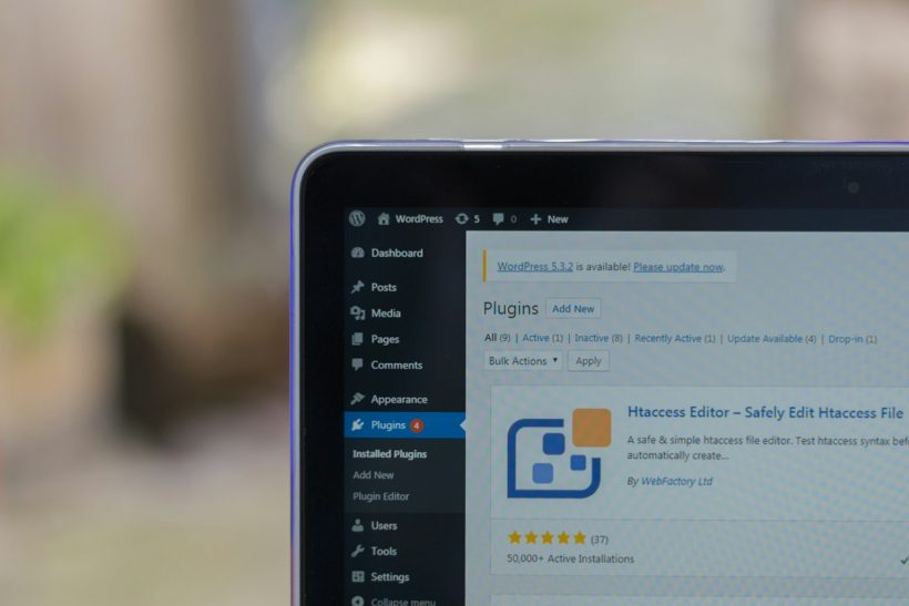
Install Required Plugins
Navigate to Plugins > Add New in your WordPress dashboard and search for the plugins you need. Install and activate them to enhance your theme’s capabilities.
Essential Plugins for PSD Themes
Elementor
Elementor is a drag-and-drop page builder that simplifies design adjustments and content creation.
- Features:
- Intuitive interface for building pages visually.
- Extensive library of pre-designed templates.
- Responsive editing for mobile optimization.
- Benefits for PSD Themes:
Elementor allows you to translate your PSD design into a pixel-perfect WordPress theme without extensive coding. - Learn More: Visit Elementor Official Site.
Advanced Custom Fields (ACF)
ACF lets you add custom fields to your WordPress posts and pages, improving content management.
- Features:
- Create fields like text, images, and dropdowns.
- Display custom fields dynamically on the front end.
- Benefits for PSD Themes:
ACF enables seamless integration of dynamic content, such as product details or client testimonials, in PSD-based themes. - Learn More: Explore ACF Documentation.
WooCommerce
WooCommerce is essential for PSD themes designed for e-commerce websites.
- Features:
- Tools to add products, manage inventory, and process payments.
- Extensive plugin library for customization.
- Benefits for PSD Themes:
WooCommerce transforms static PSD designs into functional online stores with minimal effort. - Learn More: Visit WooCommerce Official Site.
WP Super Cache
Caching plugins like WP Super Cache enhance site performance by reducing load times.
- Features:
- Generate static HTML files for faster loading.
- Support for CDN integration.
- Benefits for PSD Themes:
Optimizes loading times, ensuring a smooth user experience for visually rich PSD themes. - Learn More: Discover WP Super Cache.
Yoast SEO
Yoast SEO helps optimize your WordPress site for search engines, ensuring high visibility.
- Features:
- Analyze content for readability and keyword usage.
- Generate XML sitemaps automatically.
- Benefits for PSD Themes:
Ensures that your theme is SEO-friendly, improving its search rankings and visibility. - Learn More: Visit Yoast SEO.
Slider Revolution
Slider Revolution adds dynamic sliders and visual effects to your WordPress theme.
- Features:
- Responsive sliders with animations.
- Support for multimedia content.
- Benefits for PSD Themes:
Perfect for showcasing hero images, portfolios, or featured content from your PSD design. - Learn More: Explore Slider Revolution.
How to Integrate Plugins into PSD Themes
Customize Plugin Settings
After installing plugins, navigate to their settings to configure features that align with your PSD design.
Maintain Design Consistency
Ensure that the plugin-generated elements match your theme’s style. Use custom CSS or built-in plugin options for styling.
Optimize for Performance
Test the theme’s performance after adding plugins to identify and resolve potential slowdowns.
Benefits of Using Plugins for PSD Themes
Enhanced Usability
Plugins provide features like navigation menus, contact forms, and search functionality, making websites more user-friendly.
Faster Development
Pre-built plugin features reduce the time required to code custom functionalities from scratch.
Scalable Designs
Plugins ensure that themes can be easily updated and expanded as user needs evolve.
Improved User Engagement
Add interactive elements like sliders, galleries, and forms to keep users engaged.
Challenges of Using Plugins
Compatibility Issues
Some plugins may not integrate smoothly with your theme, requiring additional troubleshooting.
Performance Impact
Overloading your theme with too many plugins can slow down the website. Use only essential plugins.
Learning Curve
Each plugin has its own setup and features, requiring time to understand and implement effectively.
Best Practices for Plugin Management
Limit Plugin Usage
Use only the plugins necessary for your theme’s functionality to maintain optimal performance.
Keep Plugins Updated
Regularly update plugins to ensure compatibility with the latest version of WordPress.
Test Before Deployment
Test plugins in a staging environment to identify potential conflicts or performance issues.
Monitor Performance
Use tools like GTmetrix to assess the impact of plugins on loading times.
Real-Life Applications
E-commerce Sites
A designer transformed their PSD e-commerce mockup into a functional store using WooCommerce and ACF.
Portfolio Websites
A photographer added dynamic galleries and contact forms to their PSD-based portfolio theme using Slider Revolution and Elementor.
Corporate Websites
A consulting firm enhanced its PSD theme with Yoast SEO for visibility and WP Super Cache for performance.
Monitoring the Performance of Your Plugins
Use Analytics
Track user interactions with plugins like contact forms or sliders using Google Analytics.
Evaluate Speed
Test page speed regularly to ensure plugins are not slowing down the site.
Gather Feedback
Collect user feedback on interactive elements to refine their functionality.
Conclusion
Plugins are indispensable for enhancing PSD-to-WordPress themes, offering tools that extend functionality, improve performance, and elevate user experience. Whether you’re using Elementor for design adjustments, WooCommerce for e-commerce, or Yoast SEO for optimization, selecting the right plugins ensures a smooth transition from static PSD designs to dynamic WordPress websites.
For more plugin recommendations, explore the WordPress Plugin Directory. By combining creative design with powerful plugins, you can create WordPress themes that are visually stunning, functional, and optimized for success.