Published in Pixel-Perfect Design
on April 8, 2025

CSS Grid is a powerful layout system that revolutionizes web design by providing a structured and flexible way to arrange elements on a web page. With its ability to create grid-based designs efficiently, CSS Grid helps developers craft perfect layouts with precision and control. Whether designing responsive websites or aligning complex components, mastering CSS Grid ensures seamless and professional results.

This guide dives into the fundamentals, advanced techniques, and best practices for using CSS Grid to build perfect layouts.

What Is CSS Grid?

CSS Grid is a layout system in CSS that allows developers to define rows and columns, organizing content in a two-dimensional grid. Unlike older layout methods like floats or flexbox, CSS Grid simplifies the process of aligning elements both horizontally and vertically.

For an introduction, explore the MDN Web Docs on CSS Grid.

Benefits of CSS Grid for Layouts

Two-Dimensional Control

CSS Grid handles both rows and columns, offering complete control over layout structure.

Simplified Responsiveness

With CSS Grid, creating responsive designs is straightforward using grid properties and media queries.

Precise Alignment

Grid areas, lines, and tracks ensure precise placement of elements, achieving a polished look.

Flexibility and Customization

CSS Grid adapts to various content types, making it ideal for everything from simple layouts to intricate designs.

Key Concepts in CSS Grid

Grid Container

The parent element that defines the grid layout.

Example:

.container {  
  display: grid;  
  grid-template-columns: repeat(3, 1fr);  
  grid-gap: 16px;  
}  

Grid Items

The child elements within a grid container. Each grid item is placed in cells defined by the grid.

Example:

<div class="container">  
  <div class="item">1</div>  
  <div class="item">2</div>  
  <div class="item">3</div>  
</div>  

Grid Tracks

The rows and columns that make up the grid.

Grid Lines

The dividing lines between rows and columns. Grid lines are numbered for easy placement.

Grid Areas

Named sections of the grid for organizing content.

Example:

.container {  
  display: grid;  
  grid-template-areas:  
    "header header header"  
    "sidebar content content"  
    "footer footer footer";  
}  

.header { grid-area: header; }  
.sidebar { grid-area: sidebar; }  
.content { grid-area: content; }  
.footer { grid-area: footer; }  

Steps to Create Perfect Layouts with CSS Grid

Define the Grid

Use the grid-template-columns and grid-template-rows properties to define the number and size of grid tracks.

Example:

.container {  
  display: grid;  
  grid-template-columns: 1fr 2fr;  
  grid-template-rows: auto;  
}  

Position Grid Items

Place grid items using the grid-column and grid-row properties to specify their starting and ending points.

Example:

.item {  
  grid-column: 1 / 3;  
  grid-row: 1 / 2;  
}  

Add Gaps

Create space between grid items using the grid-gap property.

Example:

.container {  
  grid-gap: 20px;  
}  

Use Responsive Design

Combine CSS Grid with media queries to adapt layouts for different screen sizes.

Example:

@media (max-width: 768px) {  
  .container {  
    grid-template-columns: 1fr;  
  }  
}  

Advanced Techniques for CSS Grid

Fractional Units

Use the fr unit to divide space proportionally.

Example:

.container {  
  grid-template-columns: 2fr 1fr;  
}  

Minmax Function

Define flexible grid tracks with a minimum and maximum size.

Example:

.container {  
  grid-template-columns: repeat(3, minmax(100px, 1fr));  
}  

Auto Placement

Let CSS Grid automatically place items with the grid-auto-rows or grid-auto-flow properties.

Example:

.container {  
  grid-auto-rows: min-content;  
}  

Nested Grids

Combine multiple grids by nesting grid containers within each other.

Example:

.nested-container {  
  display: grid;  
  grid-template-columns: repeat(2, 1fr);  
}  

Tools to Master CSS Grid

Grid Generator

CSS Grid Generator is an interactive tool for building grid layouts.

Grid Inspector

Use browser developer tools like Firefox Grid Inspector to visualize and debug grids.

CSS Tricks Guide

CSS Tricks provides a comprehensive guide to CSS Grid with examples.

Best Practices for CSS Grid Layouts

Plan Your Layout

Sketch your layout or create a wireframe to define grid areas and item placements.

Combine Grid with Flexbox

Use CSS Grid for large-scale layouts and flexbox for detailed alignment within grid items.

Test for Accessibility

Ensure grid layouts are accessible by using semantic HTML and following ARIA guidelines.

Optimize for Performance

Minimize CSS complexity by using reusable classes and avoiding over-nesting.

Validate Cross-Browser Compatibility

Test your grid layouts on multiple browsers to ensure consistency.

Common Mistakes and How to Avoid Them

Overcomplicating the Grid

Keep grid definitions simple and avoid unnecessary complexity that can hinder readability.

Ignoring Responsiveness

Always test layouts on various screen sizes and devices to maintain usability.

Skipping Browser Testing

Validate grid functionality on browsers like Chrome, Firefox, Safari, and Edge to catch inconsistencies.

Real-Life Applications of CSS Grid

E-commerce Websites

An online store used CSS Grid to create responsive product grids, enhancing the browsing experience for users on all devices.

Blogs and Portfolios

A blogging platform adopted CSS Grid to organize posts and images into visually appealing layouts.

Corporate Websites

A consulting firm utilized CSS Grid to align content and create a professional and polished homepage.

Monitoring and Refining Grid Layouts

Analyze User Feedback

Gather insights from users about layout usability and aesthetics.

Perform Regular Audits

Audit your CSS code for efficiency and eliminate unused or redundant styles.

Use Analytics

Evaluate bounce rates and engagement metrics to measure the impact of your grid layouts.

Conclusion

Mastering CSS Grid perfect layouts enables developers to create seamless, responsive, and visually striking designs. By following the techniques and best practices outlined in this guide, you can build layouts that enhance user experience and meet modern web design standards.

For additional resources, explore tools like CSS Grid Generator or refer to guides on MDN Web Docs. With CSS Grid, achieving pixel-perfect layouts has never been more efficient or accessible.

Published in Pixel-Perfect Design
on April 3, 2025

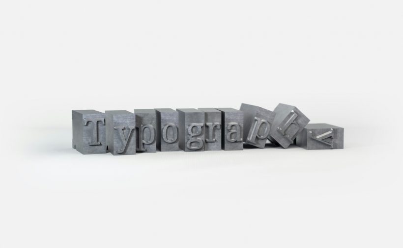
Typography plays a critical role in web design, influencing readability, user engagement, and overall aesthetics. Achieving typography for pixel-perfect websites requires attention to detail and the implementation of strategies that enhance both visual appeal and functionality. Pixel-perfect typography ensures text elements align seamlessly with other design elements, providing a polished and professional look.

This guide dives into expert tips, best practices, and tools for mastering typography in web design, ensuring your websites deliver exceptional user experiences.

The Importance of Typography in Web Design

Enhances Readability

Well-designed typography ensures that text is easy to read on all devices, reducing eye strain and encouraging users to engage with the content.

Establishes Visual Hierarchy

Typography helps organize content by emphasizing important elements such as headings, subheadings, and calls-to-action.

Strengthens Branding

Consistent typography reinforces a brand’s identity by aligning with its tone and style.

Improves Accessibility

Inclusive typography ensures that text is readable by users with visual impairments or cognitive challenges.

For more insights into typography’s impact, explore Adobe’s Typography Tips.

Key Elements of Typography for Pixel-Perfect Websites

Font Selection

Choose fonts that align with the brand’s identity and are legible across various screen sizes.

Popular web-safe fonts include:

  • Arial
  • Georgia
  • Roboto
  • Open Sans

Font Pairing

Combine fonts to create contrast while maintaining harmony. Pairing a serif font with a sans-serif font is a common practice.

Example:

  • Headings: Merriweather (Serif)
  • Body Text: Lato (Sans-serif)

Font Size

Use a responsive typography scale to ensure consistent text sizing across devices.

Example:

h1 { font-size: 2.5rem; }  
p { font-size: 1rem; }  

Line Height and Spacing

Adjust line height to ensure adequate spacing between lines, improving readability.

Example:

body {  
  font-family: 'Open Sans', sans-serif;  
  line-height: 1.6;  
}  

Color and Contrast

Select colors with sufficient contrast to ensure readability, especially for users with visual impairments. Tools like Contrast Checker can help test color combinations.

Tips for Pixel-Perfect Typography

Use a Grid System

Align text elements with a grid to ensure consistent spacing and alignment across the layout.

Example:

.container {  
  display: grid;  
  grid-template-columns: repeat(12, 1fr);  
  gap: 16px;  
}  

Leverage CSS Variables

Use CSS variables to define typography settings, enabling consistent styling and easier updates.

Example:

:root {  
  --font-primary: 'Roboto', sans-serif;  
  --font-size-base: 16px;  
  --line-height-base: 1.5;  
}  

body {  
  font-family: var(--font-primary);  
  font-size: var(--font-size-base);  
  line-height: var(--line-height-base);  
}  

Optimize for Mobile

Ensure text is responsive and legible on smaller screens by using media queries.

Example:

@media (max-width: 768px) {  
  body { font-size: 14px; }  
}  

Test Across Devices

Validate your typography on multiple devices and browsers to ensure consistent performance. Tools like BrowserStack can assist with testing.

Incorporate Web Fonts

Use web fonts to expand typography options while maintaining performance. Google Fonts is a popular choice for free web fonts.

Example of embedding a Google Font:

<link href="https://fonts.googleapis.com/css2?family=Roboto:wght@400;700&display=swap" rel="stylesheet">  

Tools for Achieving Pixel-Perfect Typography

Figma

Figma allows designers to create and refine typography systems with precision.

Adobe XD

Adobe XD provides tools for designing, testing, and validating typography in web projects.

Google Fonts

Google Fonts offers a wide selection of free web fonts optimized for performance and usability.

Typography.js

Typography.js helps developers create typographic themes and scales programmatically.

WebAIM Contrast Checker

WebAIM Contrast Checker ensures your typography meets accessibility standards.

Common Mistakes and How to Avoid Them

Overusing Font Styles

Using too many fonts or weights can create a cluttered and inconsistent design. Stick to a maximum of two to three typefaces.

Ignoring Line Length

Lines that are too long or too short can hinder readability. Aim for line lengths of 50–75 characters for optimal readability.

Neglecting Accessibility

Failing to consider accessibility can exclude users. Ensure fonts are legible and colors meet contrast standards.

Overlooking Performance

Large font files can slow down your site. Use font subsets or preload key fonts to improve loading times.

Example of preloading a font:

<link rel="preload" href="/fonts/roboto-regular.woff2" as="font" type="font/woff2" crossorigin="anonymous">  

Real-Life Applications of Pixel-Perfect Typography

E-commerce Websites

An online retailer used pixel-perfect typography to improve product descriptions’ readability, leading to higher conversions.

Corporate Websites

A consulting firm adopted a consistent typography system to align their branding across global sites.

Blogging Platforms

A blogger enhanced user engagement by refining typography, making articles easier to read and visually appealing.

Monitoring Typography Effectiveness

User Feedback

Gather feedback from users about readability and overall design quality.

Analytics

Monitor bounce rates and session durations using Google Analytics to measure the impact of typography on user engagement.

Regular Audits

Perform typography audits regularly to ensure consistency and alignment with brand standards.

Conclusion

Achieving typography for pixel-perfect websites requires a combination of design principles, technical implementation, and continuous refinement. By following the tips and tools outlined in this guide, you can create web typography that enhances readability, reinforces branding, and delivers exceptional user experiences.

For further inspiration, explore resources like Google Fonts or tools like Typography.js. With well-executed typography, your websites can leave a lasting impression and keep users engaged.

Published in Pixel-Perfect Design
on April 1, 2025

In web design and development, ensuring the accuracy of design implementation is critical to delivering high-quality projects that meet client expectations and provide a seamless user experience. When you validate work design specs, you bridge the gap between design and development, ensuring that every element aligns perfectly with the original vision.

This guide explores the importance of validating design specs, the tools and techniques to streamline the process, and best practices for achieving pixel-perfect results.

What Does Validating Design Specs Mean?

Validating design specs involves comparing a website’s live implementation to the original design mockups or prototypes. It ensures that:

  • Fonts, colors, and spacing match the provided specifications.
  • Layouts and interactions are implemented as intended.
  • The website is consistent across different browsers and devices.

For example, a designer might specify a 16px font size for body text and a 24px padding for a button. Validation checks whether these specifications are followed in the live site.

Why Validate Work Design Specs?

Ensures Design Consistency

Validation prevents discrepancies between design mockups and the final product, ensuring a cohesive and polished user experience.

Improves Client Satisfaction

Clients expect their designs to be executed accurately. Proper validation demonstrates professionalism and attention to detail.

Reduces Errors

By catching deviations early, validation minimizes costly revisions during the later stages of development.

Strengthens Collaboration

Validation fosters better communication between designers and developers, leading to more efficient workflows.

For a detailed look at design validation, explore Smashing Magazine’s Guide to Design QA.

Tools for Validating Design Specs

Figma

Figma allows developers to inspect design files for precise specifications like font sizes, colors, and spacing.

Zeplin

Zeplin bridges the gap between design and development by providing detailed style guides, assets, and measurements.

Adobe XD

Adobe XD offers design specs that developers can access directly, simplifying the validation process.

PerfectPixel

PerfectPixel is a browser extension that overlays the design mockup on the live site, enabling pixel-perfect comparisons.

Chrome DevTools

Chrome’s developer tools allow you to inspect and measure elements directly in the browser to ensure they align with design specifications.

How to Validate Work Design Specs

Step 1: Prepare the Design Files

Ensure that the design files are complete and accessible. Use tools like Figma, Sketch, or Adobe XD to provide developers with measurements, assets, and style guides.

Step 2: Use a Design Overlay

Use tools like PerfectPixel to overlay the design mockup onto the live site. This visual comparison helps identify mismatched elements.

Step 3: Inspect CSS Properties

Use browser developer tools to inspect CSS properties and compare them to the specifications in the design file.

Example of validating font size in Chrome DevTools:

  1. Right-click on the element and select “Inspect.”
  2. Check the computed font size in the Styles pane.
  3. Compare it with the design specs.

Step 4: Test Across Devices

Validate the design on various devices and screen sizes to ensure responsive consistency.

Step 5: Gather Feedback

Collaborate with designers and developers to review findings and address discrepancies.

Common Design Specs to Validate

Typography

Ensure that font families, sizes, weights, and line heights match the design file.

Colors

Check that all colors, including text, backgrounds, and borders, are consistent with the provided palette.

Spacing

Validate margins, padding, and alignment to ensure that elements are spaced correctly.

Images and Icons

Confirm that images and icons are of the correct size, resolution, and placement.

Interactions

Test hover effects, animations, and click behaviors to ensure they function as intended.

Responsive Design

Validate that the layout adapts smoothly to different screen sizes and resolutions.

Challenges in Validating Design Specs

Inconsistent Measurements

Design tools and browsers may interpret measurements differently, leading to minor discrepancies.

Cross-Browser Variations

Certain styles may render differently across browsers, requiring additional tweaks.

Dynamic Content

Dynamic content, such as user-generated posts, can cause deviations from the static design.

Best Practices for Validating Work Design Specs

Establish Clear Communication

Ensure designers and developers collaborate closely during the project. Regular check-ins help prevent misunderstandings.

Use a Shared Style Guide

Create a shared style guide that outlines typography, colors, and spacing. This ensures consistency throughout the project.

Validate Iteratively

Perform validation at every stage of the development process, rather than waiting until the end.

Focus on Key Elements

Prioritize validating critical elements like navigation, calls-to-action, and forms, as these have the most significant impact on user experience.

Document Discrepancies

Keep a record of any deviations from the design specs and provide actionable recommendations for resolution.

Real-Life Applications of Design Validation

E-commerce Websites

An online retailer validated their checkout page to ensure alignment with the original design, improving user trust and conversion rates.

Corporate Websites

A consulting firm conducted design validation to maintain brand consistency across their global website.

SaaS Platforms

A SaaS company validated their dashboard’s design to ensure a seamless user experience across multiple devices.

Tools for Automating Design Validation

Storybook

Storybook helps developers test and validate UI components in isolation, ensuring they match design specs.

Visual Regression Testing Tools

Tools like Percy and BackstopJS automate visual comparisons between design mockups and live implementations.

Accessibility Testing Tools

Use tools like WAVE to validate accessibility compliance, ensuring the design is inclusive.

Monitoring and Refining the Validation Process

Collect Feedback

Gather input from stakeholders, designers, and developers to refine the validation process.

Track Revisions

Monitor the number of revisions required during the project to identify patterns and areas for improvement.

Use Analytics

Evaluate user behavior and engagement to measure the impact of design accuracy on user experience.

Conclusion

Validating design specs is a vital step in ensuring that web projects meet their intended design and functionality goals. By following the steps and best practices outlined in this guide, you can confidently validate work design specs, reducing errors and delivering high-quality websites that exceed expectations.

For more resources, explore tools like Zeplin or Storybook. With consistent validation processes, your projects will achieve the accuracy and professionalism that clients and users demand.

Published in Pixel-Perfect Design
on January 2, 2025

Creating visually appealing and functional websites is a top priority for designers. One approach that continues to stand out is building pixel-perfect websites. This method ensures that every element aligns perfectly with the design mockup, reflecting precision, consistency, and attention to detail.

This guide explores what makes pixel-perfect websites a favorite among designers, the tools and techniques used to achieve them, and why they contribute to superior user experiences.

Understanding Perfect Websites

Pixel-perfect websites are meticulously crafted to match design mockups down to the last pixel. They ensure that all elements, including spacing, alignment, and proportions, are implemented precisely as intended by the designer.

Pixel perfection is about maintaining a seamless translation of a design from tools like Figma or Photoshop into a functional web page, preserving the design’s integrity across all devices and screen sizes.

Why Pixel-Perfect Websites Are Important

The pursuit of precision in web design isn’t just about aesthetics—it has tangible benefits.

  • Professional Appearance: Ensures a polished and cohesive design that reflects the brand’s identity.
  • Enhanced User Experience: Consistency and clarity make websites easier to navigate and engage with.
  • Client Satisfaction: Clients appreciate when their vision is brought to life with high fidelity.
  • Competitive Edge: A visually superior website stands out in a crowded online marketplace.

How Designers Achieve Pixel-Perfect Websites

Achieving pixel-perfect websites requires a combination of best practices, attention to detail, and the right tools.

Tools for Pixel Perfection

Designers and developers rely on various tools to ensure precision:

  • Figma: Offers detailed design inspection features, making it easy to extract exact dimensions and spacing. Visit Figma to explore its features.
  • Adobe XD: Allows designers to share specs directly with developers for seamless handoff. Learn more at Adobe XD.
  • PerfectPixel: A browser extension that overlays design mockups on live web pages, ensuring precise alignment. Check it out at PerfectPixel.
  • Zeplin: Bridges the gap between design and development by generating specs, assets, and CSS code. Visit Zeplin for details.

Best Practices for Pixel-Perfect Websites

  • Use Grid Systems: Grids ensure consistent spacing and alignment across elements.
  • Standardize Measurements: Use pixels or rems for consistent sizing and spacing.
  • Optimize Typography: Pay close attention to font size, line height, and letter spacing to match the design mockup.

The Role of Collaboration

Websites are a collaborative effort between designers and developers.

Clear Communication

Designers should provide detailed documentation, including font styles, colors, and spacing guidelines, to avoid misinterpretation. Tools like Slack or Asana can streamline communication.

Feedback Loops

Regular design reviews and feedback sessions ensure alignment between the design and the implemented website.

Common Challenges in Building Pixel-Perfect Websites

While the concept is straightforward, achieving pixel perfection comes with its own set of challenges.

Browser Inconsistencies

Web browsers interpret CSS differently, which can lead to minor design discrepancies. Tools like BrowserStack help test designs across multiple browsers and devices.

Responsiveness

Ensuring pixel perfection on different screen sizes requires careful planning and the use of responsive design techniques, such as media queries.

@media (max-width: 768px) {  
    .content {  
        padding: 10px;  
    }  
}  

Performance vs. Precision

High-quality images and design assets can impact website performance. Tools like TinyPNG optimize images without losing quality.

Benefits of Pixel-Perfect Websites

Pixel-perfect websites offer several advantages that go beyond aesthetics.

Brand Integrity

Maintaining design fidelity ensures that the brand’s identity is consistent across all touchpoints, building trust and recognition.

Better Usability

Precise designs create intuitive interfaces, improving user interaction and satisfaction.

Improved Conversion Rates

A polished, professional website can positively influence user behavior, encouraging actions like making purchases or signing up for newsletters.

How Pixel-Perfect Websites Impact SEO

While SEO focuses on content and technical optimization, design also plays a role.

  • Improved Accessibility: Clean designs enhance readability and navigation, positively impacting user experience metrics like bounce rates.
  • Faster Load Times: Pixel-perfect designs often use optimized assets, improving page speed—a key SEO ranking factor.
  • Mobile Optimization: Ensuring pixel perfection on mobile devices improves usability and mobile SEO rankings.

Real-Life Examples of Pixel-Perfect Websites

Several brands have set the standard for pixel-perfect design.

  • Apple: Known for its flawless design implementation that mirrors its minimalist brand identity. Visit Apple for inspiration.
  • Dropbox: Demonstrates how consistency and precision create a seamless user experience. Explore Dropbox.

Tips for Maintaining Pixel Perfection

Maintaining pixel perfection requires ongoing attention to detail and a proactive approach.

  • Conduct Regular Audits: Review your website periodically to ensure it aligns with the original design.
  • Stay Updated with Trends: Modern design trends may require adjustments to maintain a contemporary look.
  • Use Version Control: Tools like GitHub help track changes and roll back if discrepancies occur.

When Pixel Perfection May Not Be Necessary

While pixel-perfect websites have their benefits, there are cases where strict adherence may not be feasible.

  • Content-Driven Websites: For blogs or news sites, content structure may take precedence over exact design replication.
  • Budget Constraints: Smaller projects may prioritize functionality over pixel perfection.
  • Agile Environments: Rapid development cycles may leave little time for fine-tuning visual details.

In such cases, a balanced approach that prioritizes key design elements is recommended.

Conclusion

Pixel-perfect websites continue to be a benchmark for quality in web design and development. They showcase the collaboration between designers and developers to create visually stunning and highly functional digital experiences.

By leveraging the right tools, following best practices, and maintaining a focus on collaboration, you can ensure that your projects meet the highest standards. Whether you’re a designer aiming for perfection or a developer bringing designs to life, the pursuit of pixel-perfect websites will always lead to superior results.

Explore these techniques and start building your own pixel-perfect websites to deliver exceptional value to clients and users alike.

Published in Pixel-Perfect Design
on November 30, 2024

Design accuracy is crucial in web development, ensuring that the final product aligns with the original design mockups. Whether you’re creating a website or a mobile app, discrepancies between design and implementation can lead to a poor user experience and unsatisfied clients. Using tools measure design accuracy is essential to bridge the gap between design and development, saving time and ensuring pixel-perfect results.

This guide explores the best tools to measure design accuracy, their features, and how they streamline the development process.

Why Measuring Design Accuracy Is Important

Accuracy in design implementation is vital for several reasons:

  • Client Satisfaction: Ensures the final product matches the client’s expectations.
  • Enhanced User Experience: Maintains visual consistency for better usability.
  • Efficient Development: Reduces back-and-forth corrections and saves time.

By using tools to measure design accuracy, teams can avoid miscommunication and deliver high-quality results efficiently.

Challenges in Maintaining Design Accuracy

Even with detailed mockups, maintaining design accuracy during development can be challenging:

  • Browser Differences: Variations in rendering across browsers can affect layouts and styles.
  • Scaling Issues: Designs may not translate well across screen sizes.
  • Interpretation Errors: Developers may misinterpret design elements without clear guidelines.

These challenges underscore the importance of tools that help ensure accuracy.

Popular Tools to Measure Design Accuracy

Various tools can help developers and designers collaborate effectively by comparing designs to the implemented code.

PerfectPixel

PerfectPixel by WellDoneCode is a browser extension that allows you to overlay design mockups on a live website.

  • Key Features:
    • Adjust opacity for precise comparisons.
    • Supports PNG and JPG file formats.
    • Works on Chrome and Firefox browsers.
  • Use Case: Ideal for frontend developers checking pixel-perfect alignment.

Learn more at PerfectPixel.

Zeplin

Zeplin is a collaboration tool that bridges the gap between designers and developers by providing design specifications.

  • Key Features:
    • Generates measurements, CSS properties, and assets directly from designs.
    • Integrates with design tools like Figma, Sketch, and Adobe XD.
    • Facilitates team collaboration with shared design spaces.
  • Use Case: Perfect for large teams managing multiple design-to-code projects.

Visit Zeplin to explore its features.

Figma

Figma is a cloud-based design tool that includes built-in design inspection tools.

  • Key Features:
    • Allows developers to inspect layers, styles, and dimensions.
    • Provides CSS code snippets for quick implementation.
    • Enables real-time collaboration between designers and developers.
  • Use Case: Suitable for teams using Figma for mockup creation.

Try Figma at Figma.

Avocode

Avocode simplifies the handoff process by providing detailed design specifications and collaboration tools.

  • Key Features:
    • Supports Sketch, Adobe XD, Photoshop, and Figma files.
    • Offers measurements, colors, and code snippets for developers.
    • Works on both desktop and web applications.
  • Use Case: Great for cross-platform design handoffs.

Learn more at Avocode.

Adobe XD

Adobe XD includes design-to-development features that help measure and maintain design accuracy.

  • Key Features:
    • Generate design specs and share interactive prototypes.
    • Integrates with tools like Zeplin for advanced handoffs.
    • Provides CSS code and asset export options.
  • Use Case: Recommended for teams using Adobe Creative Cloud.

Explore Adobe XD at Adobe.

Features to Look for in Design Accuracy Tools

When choosing tools to measure design accuracy, consider these essential features:

  • Overlay Capabilities: Allows you to compare design mockups directly against the live implementation.
  • Design Specifications: Provides measurements, color values, and typography details.
  • Collaboration Features: Facilitates communication between designers and developers.
  • Cross-Platform Compatibility: Supports multiple design tools and platforms.
  • Real-Time Updates: Enables immediate feedback on design changes.

Selecting the right tool ensures your team works efficiently and accurately.

Steps to Measure Design Accuracy

To achieve design accuracy, follow these steps using the right tools.

Import Design Files

Start by importing your design mockups into tools like Figma, Zeplin, or Avocode. Ensure that all elements, such as fonts, images, and colors, are correctly included.

Inspect Design Specifications

Use the tool’s inspection features to extract dimensions, padding, margins, and other design details. Compare these specifications with the implemented code.

Overlay Mockups

Overlay the design file onto the live website using tools like PerfectPixel. Adjust opacity and zoom to identify any mismatches.

Test Responsiveness

Check how the design adapts to different screen sizes. Use browser developer tools or testing platforms like BrowserStack for cross-device compatibility.

Make Adjustments

If discrepancies are found, make the necessary changes in your code or communicate feedback to the development team.

Benefits of Using Design Accuracy Tools

Adopting tools to measure design accuracy provides several advantages:

  • Streamlined Collaboration: Improves communication between designers and developers.
  • Faster Turnaround: Reduces time spent on revisions and debugging.
  • Consistent Quality: Ensures the final product matches the original design vision.
  • Client Satisfaction: Builds trust by delivering projects that align with expectations.

Common Mistakes to Avoid

Even with the best tools, certain pitfalls can compromise design accuracy:

  • Ignoring Browser Testing: Always test across multiple browsers to ensure consistency.
  • Overlooking Responsiveness: Designs must work seamlessly on all devices.
  • Relying Solely on Automation: Manual checks are crucial to catching subtle inconsistencies.

Avoiding these mistakes ensures a smoother workflow and better results.

Staying Updated with Design Accuracy Trends

Design and development tools evolve rapidly. Stay informed to ensure your workflow remains efficient and modern.

  • Follow Industry Blogs: Sites like Smashing Magazine and CSS-Tricks offer valuable insights.
  • Engage with Communities: Join forums and social media groups dedicated to design and development.
  • Attend Webinars: Platforms like Eventbrite host events on web design trends and tools.

Conclusion

Ensuring accuracy in design implementation is a critical aspect of web development. By using tools measure design accuracy, developers and designers can bridge the gap between concepts and final products, delivering pixel-perfect results efficiently.

From overlay tools like PerfectPixel to comprehensive collaboration platforms like Zeplin and Figma, there’s a solution for every team’s needs. By incorporating these tools into your workflow and following best practices, you can streamline your processes, reduce errors, and enhance the quality of your projects. Start exploring these tools today to elevate your design and development efforts.

Published in Pixel-Perfect Design
on November 2, 2024

Pixel-perfect development is the gold standard in web design and front-end development, ensuring that every element aligns perfectly with the intended design. For developers, mastering this skill not only enhances the user experience but also builds trust with clients and stakeholders. Learning how to achieve pixel-perfect results requires attention to detail, the right tools, and a structured approach.

This guide explores strategies, tools, and best practices to ensure precision and consistency in your front-end development projects.

Understanding Pixel-Perfect Development

Pixel-perfect development means ensuring that a website or application matches its design mockups exactly, down to the smallest details. This involves aligning visual elements, maintaining consistent spacing, and ensuring design integrity across devices.

Key benefits include:

  • Enhanced User Experience: Consistent and precise layouts improve usability and aesthetics.
  • Brand Integrity: Accurate implementation reflects professionalism and brand consistency.
  • Client Satisfaction: Meeting design expectations builds trust with clients and stakeholders.

Tools to Achieve Pixel-Perfect Results

Using the right tools can significantly streamline the pixel-perfect development process.

Design Software

Work with high-quality design files from software like:

  • Figma: Collaborative interface design tool. Learn more at Figma.
  • Adobe XD: Comprehensive tool for designing user experiences. Explore Adobe XD.
  • Sketch: A vector-based design tool widely used in UI/UX. Check out Sketch.

Browser Extensions

Browser extensions help compare your implementation with the design:

  • PerfectPixel by WellDoneCode: Overlay design mockups on a webpage for alignment checks. Install from Chrome Web Store.
  • PixelSnap: Measure and ensure pixel-perfect alignment directly on the screen.

Development Tools

Use tools that enhance precision in coding and layout management:

  • CSS Frameworks: Tailwind CSS or Bootstrap offer structured styling options. Visit Tailwind CSS or Bootstrap.
  • Grid and Flexbox: CSS grid and flexbox systems ensure consistent layouts. Learn CSS grid at MDN Web Docs.

Key Steps to Achieve Pixel-Perfect Results

Achieving precision in front-end development requires a methodical approach, from setting up your project to refining the final product.

Analyze the Design

Start by thoroughly reviewing the design mockups. Identify:

  • Fonts and typography specifications.
  • Colors, gradients, and shadows.
  • Padding, margins, and spacing for elements.

Document these details to ensure they are not overlooked during development.

Set Up a Design System

A design system creates consistency in your development process. Include:

  • Global styles for typography and colors.
  • Components and reusable elements.
  • Spacing scales for padding and margins.

Use Accurate Measurements

Convert design specifications into CSS properties accurately. For instance:

  • Use rem or em units for font sizes to maintain scalability.
  • Implement exact pixel values for widths, heights, and spacing when required.

Testing for Pixel-Perfect Accuracy

Testing is essential to ensure your implementation matches the design mockup perfectly.

Compare Designs and Implementation

Overlay the design file on your live webpage using tools like PerfectPixel. Adjust layouts until the alignment is precise.

Cross-Browser Testing

Test your site across multiple browsers to ensure consistent rendering. Use tools like:

Test Responsiveness

Ensure the design adapts seamlessly to various screen sizes. Tools like Chrome DevTools or Responsively can help simulate different devices.

Addressing Challenges in Pixel-Perfect Development

Developers often face challenges when striving for pixel-perfect results. Here’s how to tackle common issues:

Variations Across Browsers

Different browsers render elements slightly differently. Use CSS resets and normalize styles with libraries like Normalize.css.

Performance Impact

Heavy styling can slow down your site. Optimize performance by:

  • Minimizing CSS files with tools like Autoptimize.
  • Using modern image formats like WebP.

Handling Client Feedback

Clients may request changes after implementation. Maintain clear communication and use collaborative tools like InVision for feedback integration.

Best Practices for Pixel-Perfect Development

Adhering to best practices ensures efficiency and accuracy in your workflow.

Create a Style Guide

A style guide helps maintain consistency across pages. Include guidelines for typography, colors, and component styling.

Use Version Control

Track changes and collaborate with team members using Git. Platforms like GitHub or GitLab are essential for version control.

Keep Code Clean

Write modular and reusable code to simplify maintenance and updates. Follow CSS methodologies like BEM (Block Element Modifier) for organized styling.

Benefits of Pixel-Perfect Development

Prioritizing precision in front-end development offers several advantages:

  • Better User Experience: Users enjoy a seamless and visually appealing interface.
  • Higher Client Satisfaction: Meeting design expectations builds client trust.
  • Stronger Brand Perception: Consistent design enhances brand professionalism.

Conclusion

Achieving pixel-perfect results in front-end development requires a blend of meticulous attention to detail, the right tools, and a structured approach. By leveraging design tools like Figma, testing with browser extensions like PerfectPixel, and adhering to best practices, you can ensure your implementation aligns perfectly with the intended design.

Whether you’re developing a personal project or working with clients, following the strategies outlined in this guide will help you consistently achieve pixel-perfect results, elevating your web design projects to a professional standard.